Process journal
Initial notebook sketches – Tuesday, 15 August 2023
(This is a retroactive commit of the (iPad) notebook sketching I did in starting to think about the game.)
Early sketching and thinking on 15 August 2023
Started a Unity project – Thursday, 17 August 2023
Well, one of the big things is just opening Unity and I can at least claim to have done that over today. I created a Unity project in the most recent LTS version (2022.3.7f1 LTS for the record), made a cube, and built it for WebGL so that there’s something to see. Then built it again with a decompression fallback because it didn’t want to load. Now it loads, but I observe that there is the typical irony when you don’t really plan things out: there are no shadows in that first build. Because there’s only a cube and nothing for it to case a shadow on. And I guess because of the angle of the camera none of the visible faces of the cube are shadowed either. So, haha.
At any rate, the project is underway. Next step is to fire up ProBuilder and hope like hell it behaves better in this build of Unity than it did when I was trying to use it in v r $4.99.
The shitties and gritties of terrain – Monday, 21 August 2023
I actually did some of this work on Friday too but I’ve been avoiding committing because the project was in such a messed up state. But right now I’ll at least commit this journal and some thoughts on the current process.
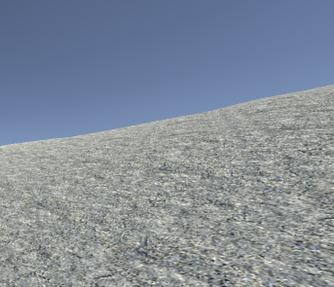
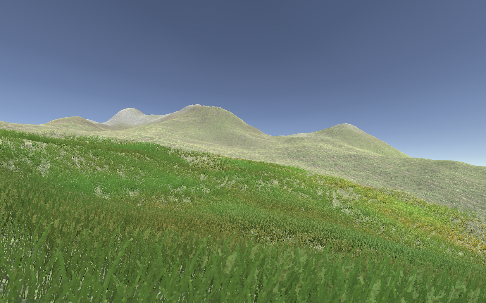
Specifically, I’ve been interested in setting up v r 5’s buildings and shadows on an island. So I grabbed a (the only easy to find) free island from the Unity asset store: Free Island Collection by Bicameral Studios. These are some nice islands my friend, notably enjoyed island 4, so I brough that into the game and was immediately confronted by the fact that its textures added up to around 200MB. When I built the game for WebGL it was landing at 104MB with just the island and a character controller which is… just too big.
But I like the idea of at least some sense of an organic landscape to go along with the more formal shadow stuff and the buildings, so I started playing around directly with some of the textures inside the pack, sizing them down, sizing them up, over and over again. Until I could barely understand what I was seeing. For instance here are three different resolutions of texture and normal map (as well as sometimes sizing down to lose information then back up to meet a resolution standard like 2048x2048):
I spent a while trying to figure out which was which until I realized something important: they all looked shitty.
So this morning I’ve gone back a step and made my own horrible island
in order to check out texturing and stuff from first principles… ish. Which meant I again grabbed a cliff texture from the island pack then downsampled it to 512x512 then back up to 2048x2048. So now the diffuse adn normal maps are both under 100KB for that one texture which is seeming more reasonable for a web download. They look gritty as hell, but I think in a way that’s hopefully acceptable down the line?
So a kind of mid-res thing going on. My next step I think is to regrab the island and either retexture it with my downsampled textures (I hope this is doable as it would be the easier option) or export the height map and retexture is manually (I hope I don’t have to do this).
Then I would have, in theory, an island with textures and I suppose I could add grass (downsampled?) and so on to a point where it looks inhabitable by this latest museum.
So that’s what I’ll tackle either now or tomorrow morning.
For the record the WebGL build of the current project (a character controller on my shitty and gritty island) is still landing at 8+ MB, but hopefully a big chuck of that is just basic Unity-stuff that’s avoidable? Will keep an eye on it.
Early questions – Wednesday, 23 August 2023
Spent a little time this morning tweaking things per commit 8070ad9.
I’m roughly at a point here where I can think about moving forward with building some structures to see what it looks like. All kinds of questions to think about and experiment with
- Should the structures be labelled in some way? Especially if I use some kind of default shape for creating a “dark room” it might be good to distinguish them. But on the other hand what would it be referring to?
- Can I get some kind of a gold material going that does “stuff” like “gleaming” in different light intensities? That being one of the most memorable elements of the book - the idea that shadows serve to emphasize other things, although of course I’m interested in looking directly at the shadows themselves just as much
- You know I hate it but: baked or realtime? Leaning realtime because it’s simpler and provides a constraint (and allows movement) and I think has a lower filesize? Not caring that much about realism. The only problem I imagine coming up is light bounces? To create different gradations of shadow you might need light bounces
- What am I lighting with? One extreme option would be just the sun/Directional light but of course I could and probably should consider rooms with point lights, spotlights, etc. since that gives us a kind of taxonomy of shadows.
- Ideas like invisible objects casting shadows could be a fun (taxonomic) idea to play with
- How involved in architecture do I want to get? Some of this process is reminding me of the Quist chapter in The Reflective Practitioner in terms of all the complexities and expertise of architects - the site and all that. I want this thing to look… well nice and intentional, but I don’t want to labour TOO hard on that effect, so simplicity will be key.
- Moving lights? Do I want the sun to be on the move all the time, or do I want to provide buttons/opportunities to make the sun move through a cycle so you can watch the effect in specific locations?
- At some point I need some water right? (I mean I should really start the to do list soon)
- And yeah I need to learn probuilder more fluidly - last time I used it I could only make stairs sideways and had to manually rotate them which felt… pretty stupid. Also: no grids? Whyyyy? Oh I found them. Okay I’m alright again.
So there’s a ton to think about, but it’s pleasing to be getting closer to building this out to try to understand what I’m thinking about here.
Probably a good step would be to literally taxonomize what possible rooms/installations I should have. So let’s do that tomorrow.
Taxonomizing shadow and light; the island as a place; structures – Thursday, 24 August 2023
Alright, it’s tomorrow.
So, I wanted to do something thinking about what is actually going to be on this island, what it means to make an island “in praise of shadows” in the context of Unity, so I’m going to think about that now.
Just a quick MDM aside: thinking about the differences between journals/todos and actual design documentation. As of right now the method doesn’t really include a formal spot to characterize the design of a project because… well it’s just the way I work. But I note that with v r $4.99 I had those “curation” documents to separate out a specific kind of work. For more complex games (maybe especially more game-y games) does it make sense to have the way the game works specified out in a text, in a … design document? Never really thought about it, but it’s worth parsing through.
Anyway for now let’s do some thinking about shadows+unity+island+the book/essay.
Nature of shadows in Unity
- Lights cause shadows
- Lights can cast Soft Shadows or Hard Shadows or No Shadows
- There are four kinds of lights:
- Directional (sun)
- Spotlight
- Point light (bulb)
- Area (shape, I think only in baked)
- Shadows are created by meshes/objects occluding lights
- Objects don’t have to be visible but can still cast a shadow
- Shadows are cast on surfaces (which are terrains, objects, meshes, etc.)
- Can invisible objects “receive shadows”?
- The shape/nature of a shadow is influenced by
- The casting light (intensity, color?, position, angle, type)
- The ambient light
- Other active lights (consider interior vs. exterior)
- The shape of the casting object (mesh, primitive, terrain, assemblies)
- This would include settings around the smallest possible hole that light can cast through?
- The shape of the receiving surface (mesh, primitive, terrain, assemblies)
- The texture of the receiving surface? (I know less about this but am assuming a shadow “looks different” cast onto surfaces that are metallic versus not etc. – this ties into the gold theme)
- There are temporal elements
- Lights can move over time (rotate, translate, combinations)
- Lights can change over properties over time (colour, intensity, shadow properties (I assume these can change??))
- Lights can turn on and off (and can strobe, though probably avoid)
- These “animation” oriented ideas could be looped or could be triggered
- Should the “sun” be moving? Should it be on computer clock time? (Leaning yes to clock time as interesting, possible with additional interactions to cycle time of day, maybe even a button the user can just hold to move time along?? Or otherwise it’s situated in the world at the highest peak or something)
- There are probably countless contextual elements
- A shadow “feels different” based on what you’re doing, the kind of place you’re in, the scale of the space, how you entered the space, and on and on
So, these are a large number of possible effects. And of course they can easily be combinatorial - soft shadows from a direct light on a large cube that moves in a circle versus hard shadows from a direct light on a large cube that moves in a circle versus…. And I don’t think the island setting is the right place for rigorous combinatorics as in v r 3, rather I want it to be an experience of shadows, and I suppose it needs to be curated, but I’d like it, too, to be an experience of the different kinds of shadows so that there’s a chance to think about it.
Curation, the island
So the island is “in praise of shadows” which means it needs to “show off” Unity’s shadows. I want it to both provide an opportunity to enjoy shadows as they are (and as the book kind of talks about them - though in the book it’s more about dimness a lot of the time?) as well as to reflect on the technical marvel of implementing shadows in an engine, as well as probably some of the comedy involved.
Should there be plaques? Or not? I lean not. A series of unexplained examples of things casting shadows. But it’s a legitimate idea and in keeping with most of the v r games – you say what these shadows are in order to provoke reflection especially about their technical nature. If my taxonomy were extreme enough I suppose you could just use single words to indicate the key elements being demonstrated? Or again you could have an accompanying PDF for your visit?
Structures
One of the key ways to demonstrate shadows in specific “lights” (ahaha) is that you control the lighting environment around them. As such I can imagine wanting quite a large number of interior spaces where there is no (or very little) light involved and so can be lit specifically with particular kinds of shadows in mind.
One thought (and here I’m thinking a little bit of The Beginner’s Guide) is to have a single room type (corresponding to that game’s single door type). And there are instances of that room all over the island that all equally cut out entirely or mostly the exterior directional light so that you can focus on what is inside. Designing that space would be a very important aspect of getting started.
Along with the rooms you would have exterior installations that deal in casting light perhaps exclusively in terms of the “sun”.
So next steps:
- try making a couple of structures just to check it out
- try making a base room that “does the trick” - wondering about a simple folded entryway to create potential darkness
Size matters – Friday, 25 August 2023
Oh how boring it is to work on build sizes, but here we are. Notably:
- I’ve been downsampling the textures to 128x128 and then resizing back up to 4096x4096 assuming that because the PNGs involved are still very very small (due to simple compression) it will all be good, but for reasons I don’t yet understand when those tiny files get into the build they balloon from like 96KB to 5MB each. Something to do with compression obviously but deeply shitty.
- Would be great to understand if it’s possible to do gzip compression stuff on github but I bet it isn’t
- So then I’ve been literally importing my textures as 128x128 files which does lead to appropriate smallness in the build, but they’re a bit blurry as I guess the default behaviour in unity for (what, the shaders?) is to blur/stretch rather than render hard edges. Can I perhaps write a shader that doesn’t do that, would that work? Can look into that.
- And then I have the extra problem that the Island terrain asset I’m using seems to have a bunch of stuff baked into it such that it’s like 50MB in the build which is taking up a ton of room.
- I exported the RAW data for it and then played around with building a new terrain (which I’d have to manually texture) from there, but even that seems to be pushing the build into pretty large sizes
All of this isn’t that interesting but having the island settled just feels really important to me, which is stupid and annoying but true. Really I could (and should) also work on some of these enclosed rooms since they don’t strictly need the island for testing.
I have it in the back of my mind to consider more of a low-poly mesh to represent the island but will that be smaller anyway? And how would I texture it at that point? Sounds fucking painful and beyond my skill level.
So my current worst case (which I still need to test step by step) is to build my own terrain with low resolution assets and texture it myself with the terrain tools and… well, just hope that it ends up being small. I suppose I’m “learning” something? None of this has a lot to do with shadows beyond the idea that context matters and there’s a strong feeling in my soul that it’s better to be casting shadows on more organic feeling territory than on something immediately pegged as “low poly”.
That’s it for now bud.
Point Filter for the Win – Friday, 1 September 2023
Been a week. As in, like, it’s been a week in both the figurative and literal senses. Or whatever, it’s been a week man.
Today, per my previous commit, Jonathan Lessard managed to save me serious trouble/sadness by pointing out you can set textures to use a “point” filter which means they scale based on nearest-neighbour or whatever, preserving hard edges and that minecrafty look we know and love. So now it’s become possible to use my 128x128 textures, scale them up so they’re less repeated-looking, but to keep them crispy instead of blurry. The result being that I think the island looks pretty nice and it’s exporting at 9.2MB textured (though not textured well enough yet).
A next task is just figuring out how to texture (and detail?) it well enough that it looks kind of busy and alive and as much like the original Island pack as possible, while being substantively smaller. I wonder now whether I can also do the point filter thing on the detail brush things as well, probably? Good if so.
Anyway I have some hopes for the island at this point and getting a build that maybe ultimately is under 20MB or something? Is that realistic? I really don’t know, probably not but still we’ve made some serious progress at this point.
So: more texturing is next, followed by returning to trying to probuild some buildings sensibly.
Textureman, textureman, doing the things that a texturecan; also Discard Changes – Tuesday, 5 September 2023
I don’t seem to be able to convince Unity to “just” use the original Island in a low-size way. Wait I’ll try something quickly…
I am trying to use the new point-filter thing to convince the “cool island” version of things to be smaller - let’s see if that works to drop down the texture siiii… nope.
So the situation is that I’m starting my island “from scratch” by
- Starting a new scene
- Creating a new terrain
- Importing the RAW exported heightmap of the Island terrain
- Lowering its resolution
- Making it smaller
- Downsampling all the textures from the Island pack to 128x128 files
- Using the point filter so that they don’t blur when scaled up
- Texturing the island ON MY DAMN OWN to try to make it look convincing enough (this is hard)
- Eventually putting detail objects on there as well for more visual interest/complexity
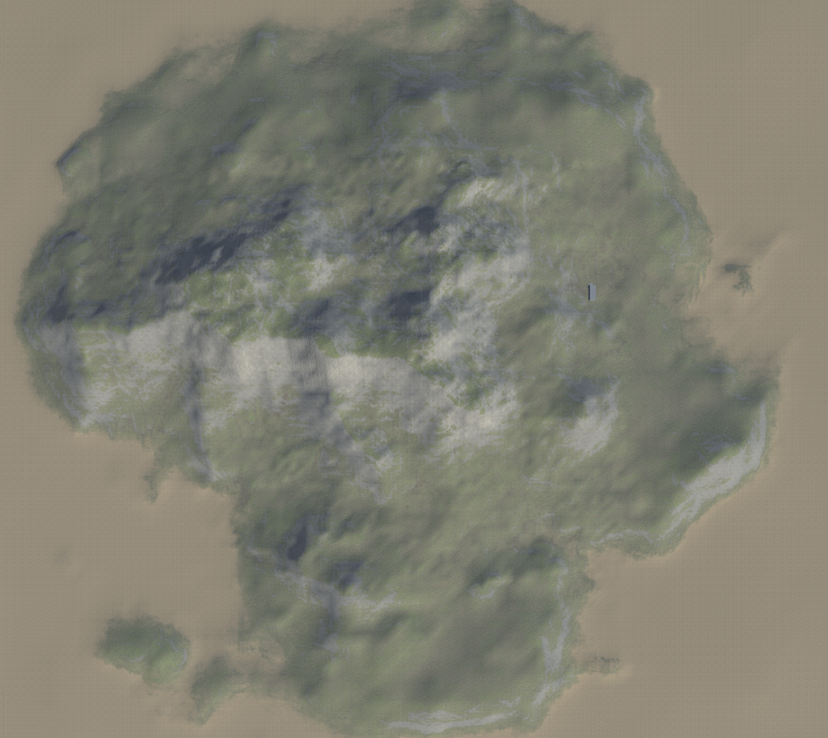
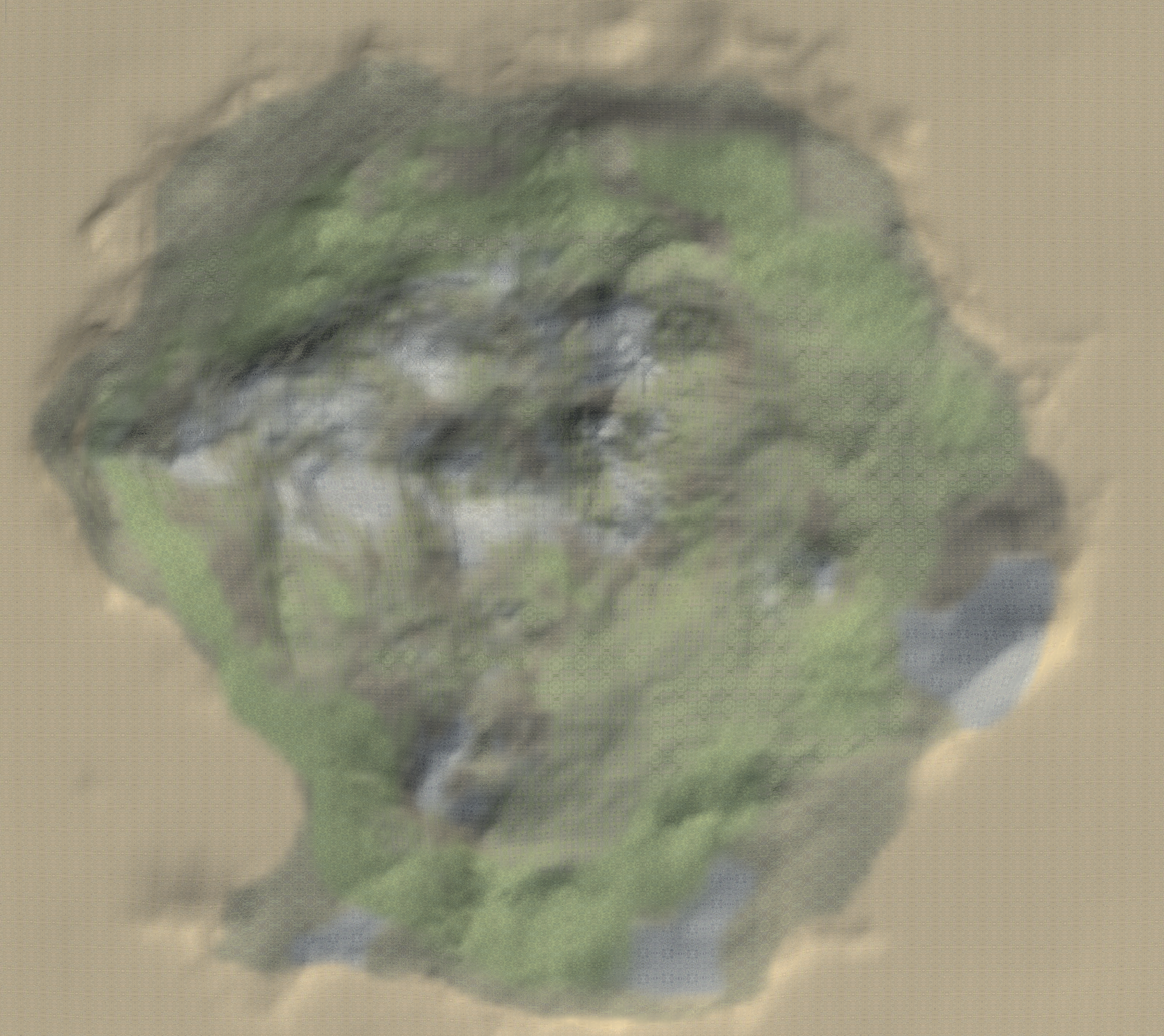
I even made these two images (one is the original island one is mine) to try to figure out areas where my texturing deviates (always assuming the people who made the original Island are texturing geniuses etc.)
Also noticed that of course you can get very visible “mixels” in this new environment, e.g.:
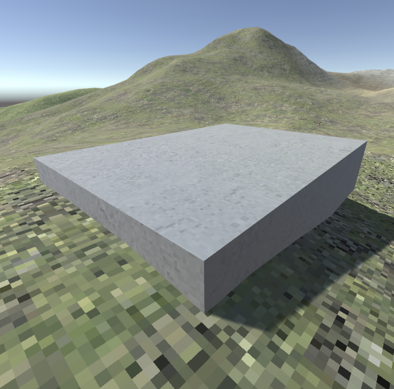
Here the concrete texture has more pixels per whatever, a higher resolution or a lower tiling rate or WHATEVER THE LINGO IS.
Should everything match in terms of that? Or is the mixelling telling us something worthwhile? Unsure and I will try to look at both at some point.
Discard Changes
Also a quick MDM note: I’ve been noticing that a frequent flow at this stage of the project is to try out some tech solution (e.g. all my to-ing and fro-ing about how to get smaller builders, interestingly crunchy textures, etc.) find that it doesn’t work at all, and then Discarding Changes in VS Code to get rid of the evidence. Should I be including every step in the repo? It doesn’t strike me as an interesting part of the process, just trying to settle very fundamental tech issues, and I am reflecting on the process in fairly fine-grained detail here in the journal, so I think the “thinking” part is still there. The bit that’s not there is mostly just dissatisfying results in the unity build that don’t necessarily communicate much and might just “take up space” in the repo.
But I dunno - should I be a pack rat and KEEP IT ALL?
The grasses blowin in the wind – Wednesday, 6 September 2023
Spent my time this morning on the grass details which are a key way to add some visual noise that drowns out the repeating textures among other things. Did a couple of quick experiments around just dumping a ton of grass on the island and exporting to see how it impacts build size (it doesn’t really).
Then tried to more carefully place the grass relative to the underlying textures (no grass on rock, less on the bare dirt, more on the green, blending the grassy grass and the more reedy grass relative to where we are on the map).
Then ran into the draw distance for the details meaning that the grass is constantly “teleporting in” as you walk which looks distractingly stupid, so found the setting to essentially make it always visible.
Then ran into the fact that because the grass colour is a bit different to the terrain palette the grass really stands out too much so I spent time working with the underlying image files as well as the tints Unity applies to get something more naturalistic. Compare this before and after, which I’m somewhat proud of (and which also includes the draw distance setting being ramped up now that I look at it):
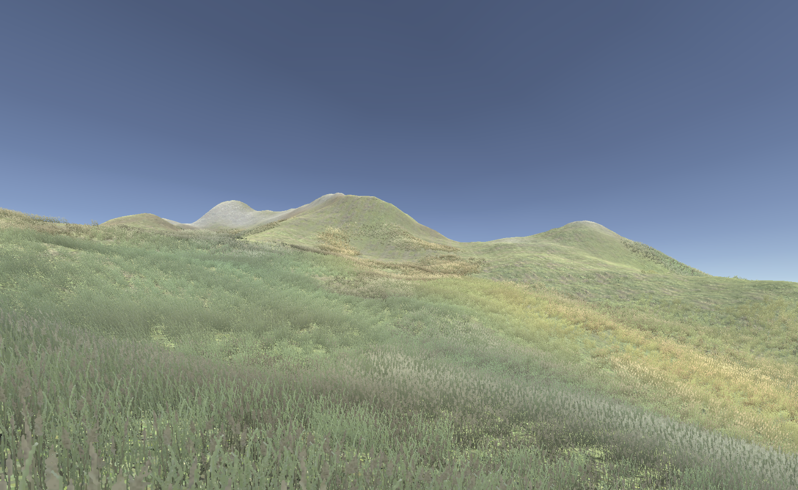
So there’s still a little bit of work remaining here, but the island is starting to look kind of how I want, which would mean I could start construction, haha, but yeah construction. Helpfully, but making it to this step I could probably feel comfortable doing some exterior shadow stuff that’s designed just to work with the sun, casting shadows on the ground, which is somehow less intimidating that the interiors for now.
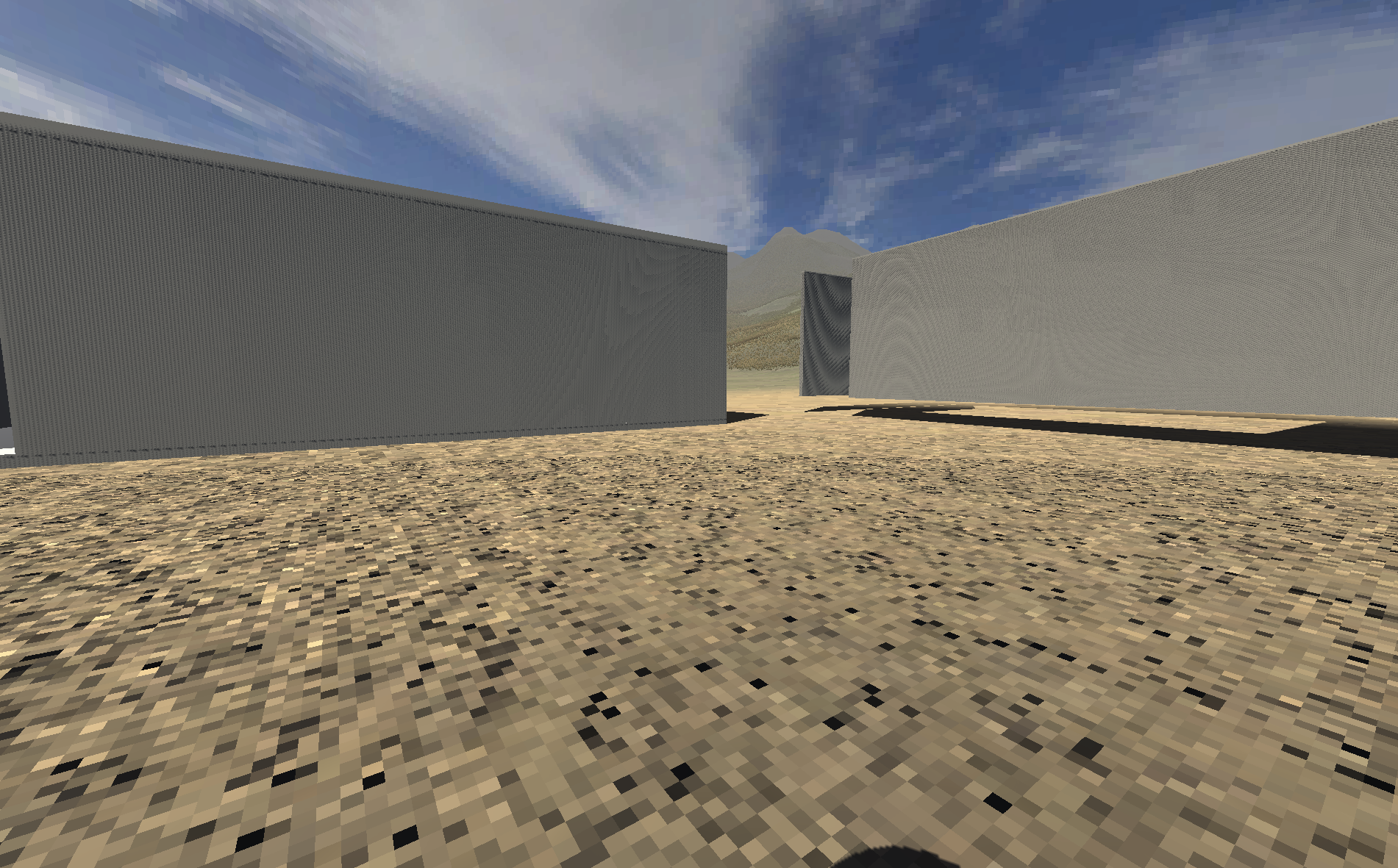
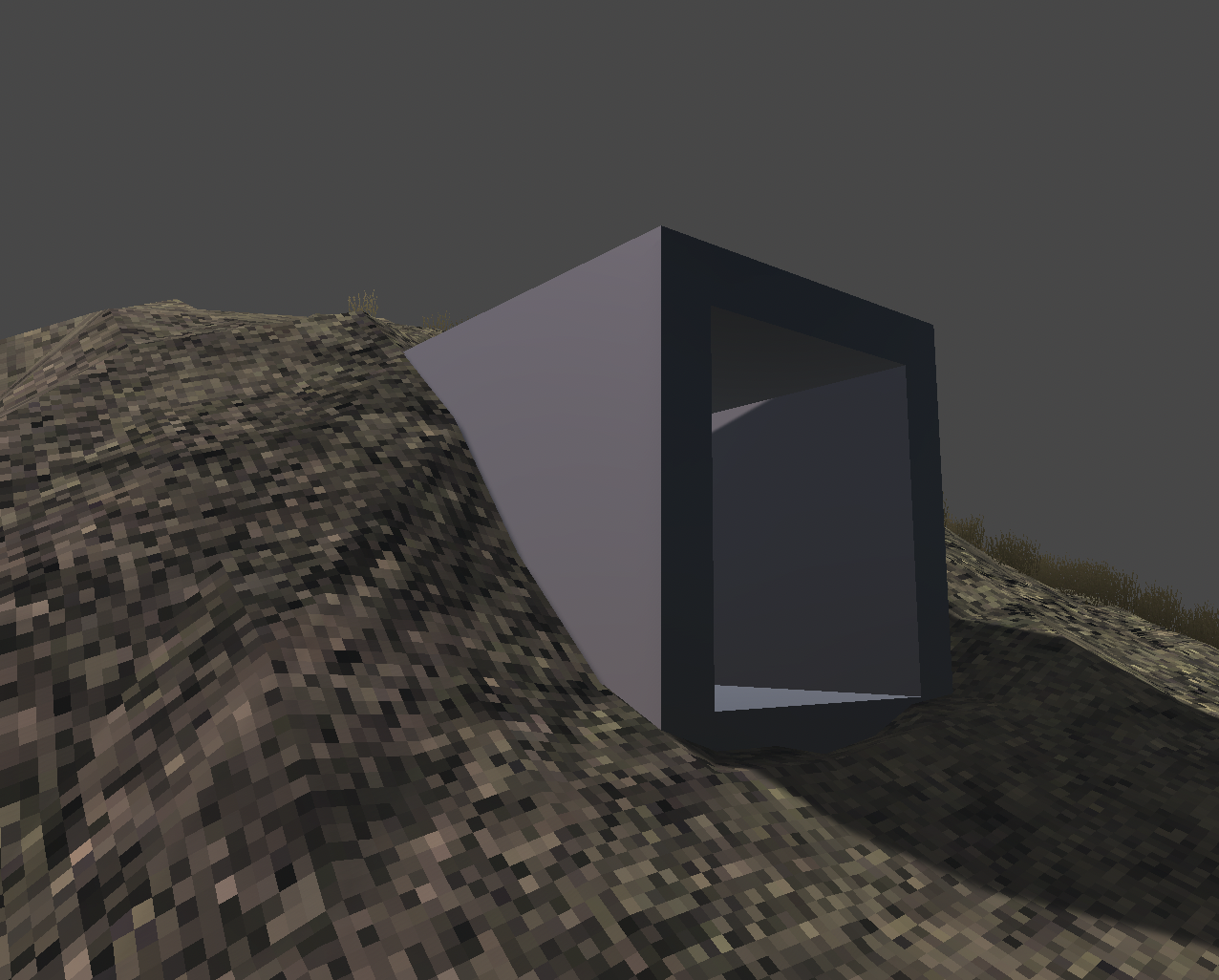
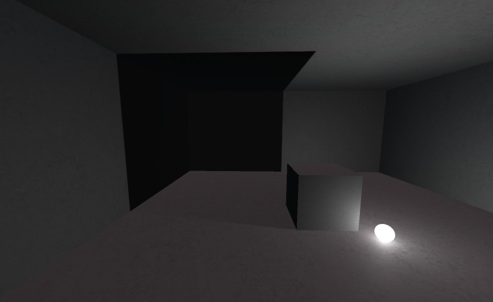
The first dark room – Monday, 11 September 2023
Dear diary, I finally made a dark room. The island itself seems to be in sufficiently good condition that it felt time to move over to shadows.
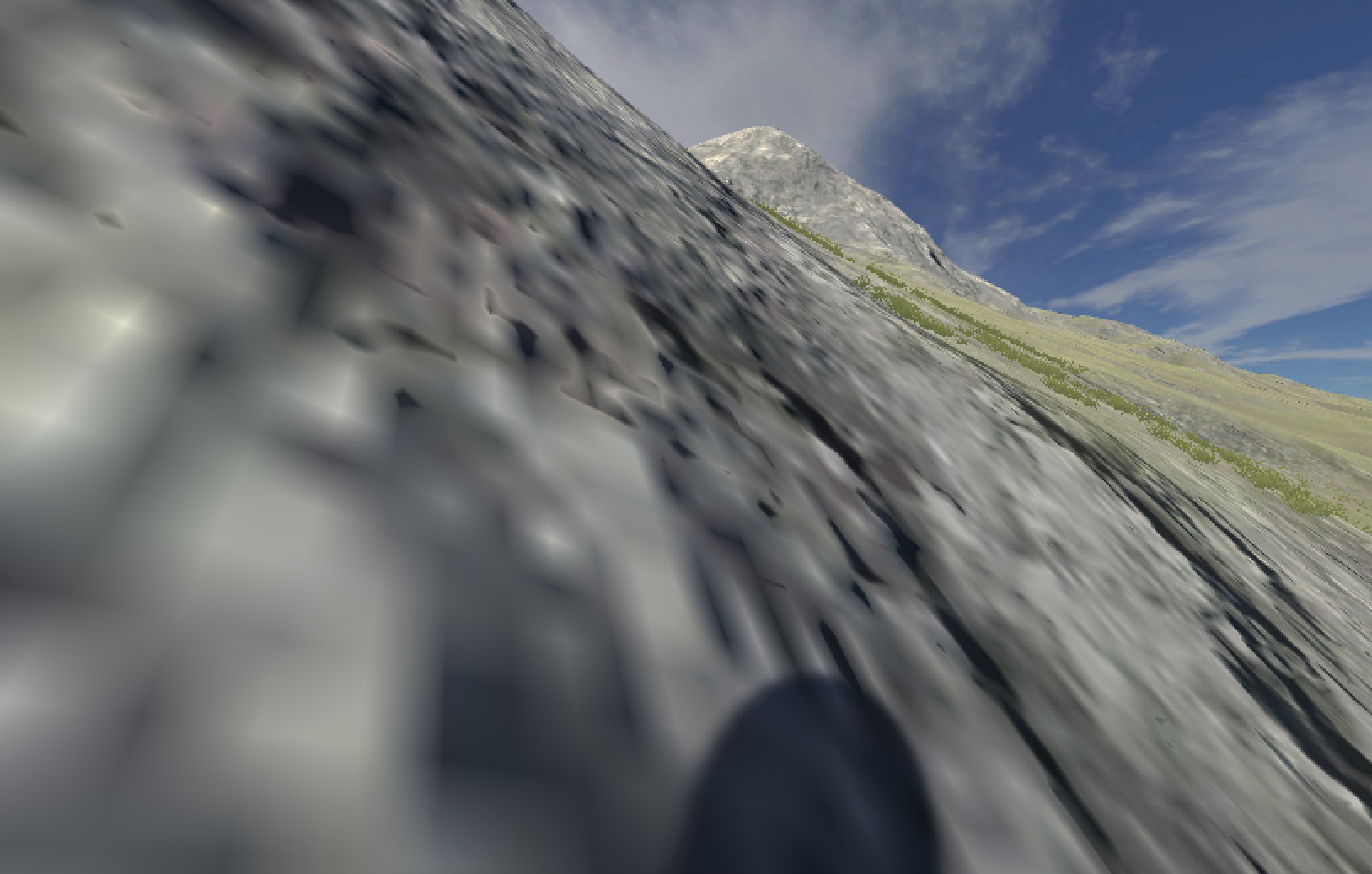
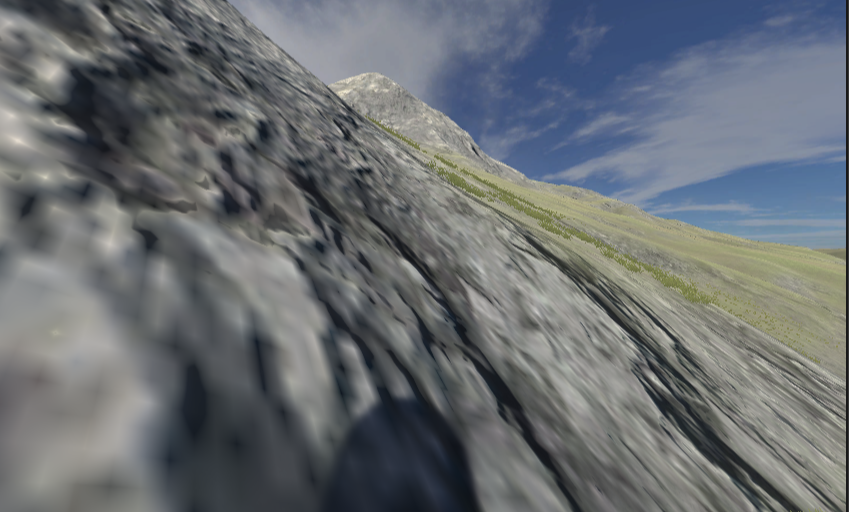
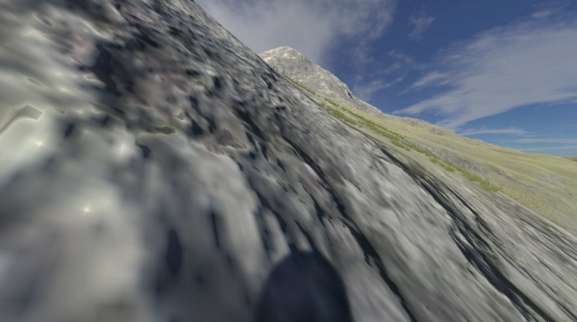
Actually, in the weekend I was showing it to Felix as well and we made a really tall square pole kind of object and I was then stunned by how long its shadow was going downhill - hills and shadows eh, who knew.
But today I finally overcame some of my ProBuilder fears by realizing I could make the floorplan for the room shapes I’ve been thinking of just using extrusion techniques. And that word “floorplan” makes me think of the fact I did a bunch of drawings last Friday on that subject, so let me get them in here too…
Sketches from Friday, 8 September 2023
Those sketches mostly are about consider audience flow through interior spaces (one door or two doors?), the whole thing of framing a view when you exit, questions around how the buildings and the terrain interact (terraforming versus stairs versus careful positioning) and the general point of having a place you can stand that moves the sun in the sky.
Actually while I was lying in bed I was thinking of the sun in the sky and thought it could be nice if it moves fast when you stand on the thing, but then stays where you set it, so it’s a kind of somewhat laborious ability to change the time of day? I quite like that.
(I should start my to-do list now or I’m going to get confused. There.)
Going on from those sketches of floorplans, as I said, I finally used ProBuilder to make a sample room, which ended up like this:
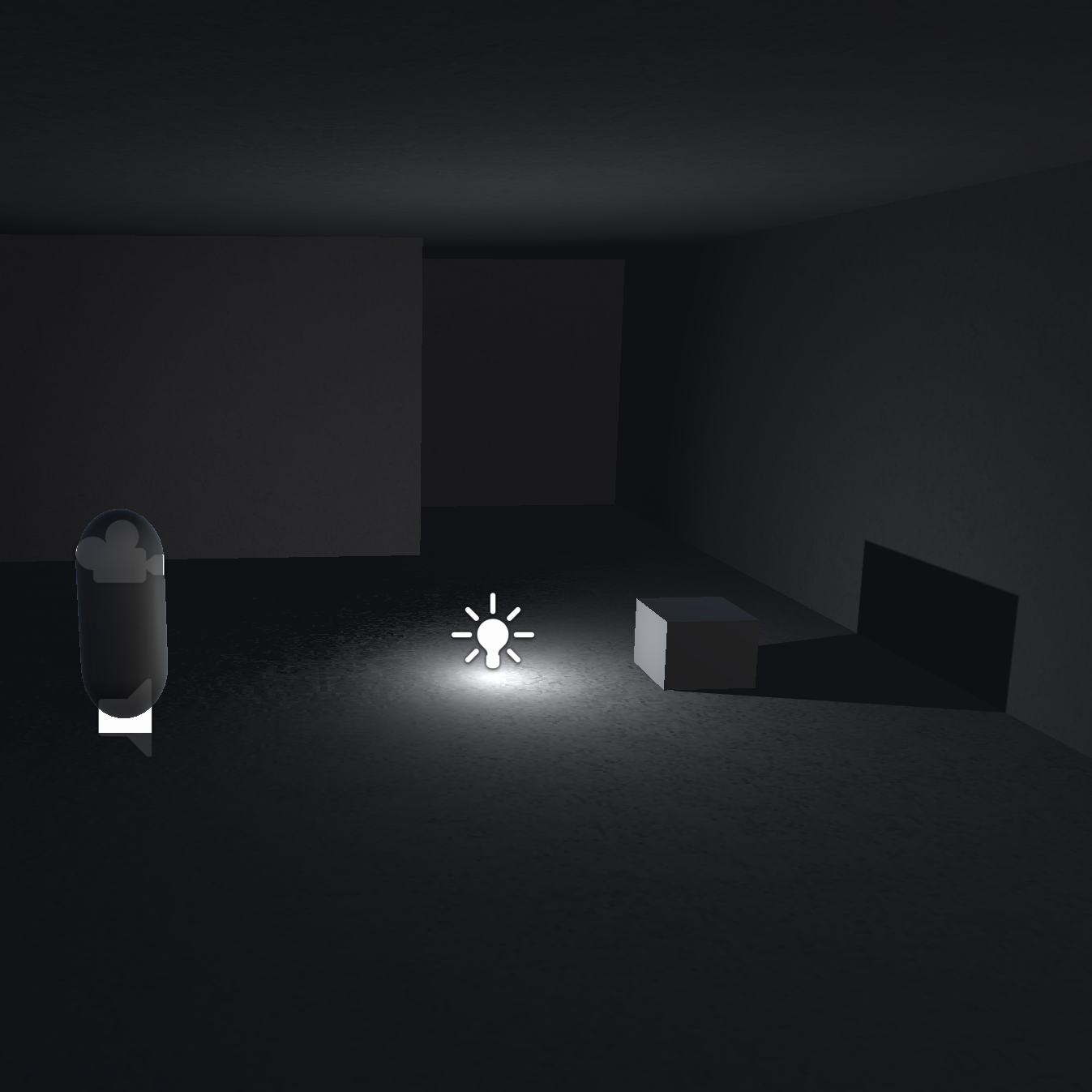
Which is to say I did manage to get a room that’s a reasonable first draft of a setting to observe a shadow in a more or less controlled environment. A few things on that process:
- Turned out I had the concrete material set up to me super metallic and I guess shiny so it wouldn’t let the room be dark (I guess simulating the idea it would just bounce around the light from the outside?) - turning that down was the big difference maker to make a dark room
- Started wondering what relationship the shadows have to bump maps
- Re-remembered that when you make a point light it doesn’t automatically cast shadows; and of course worried about performance implications with lots of lights (and then thought about - in the commit message - the idea of lights that only turn on as you enter, which has a pleasingly physical relationship to shadows?)
- I’ll need to remake the room because it has some gross seams that - yes that’s right - cast weird little shadows and make it totally clear how shonky my work is on that front – I’m more confident I’ll be able to get this working though
- Really love the contrast between inside and outside at this point, very neat, and that transitional moment (oh and now I’m like… what about that weird light effect you get passing from dark to light? Probably could figure it out but maybe not)
- And of course is this about shadows or light?
- Oh and the need to make a gold material to play with
- Shadows on grass
- Shadows down hills
- This is going to work
Space and architecture – Tuesday, 12 September 2023
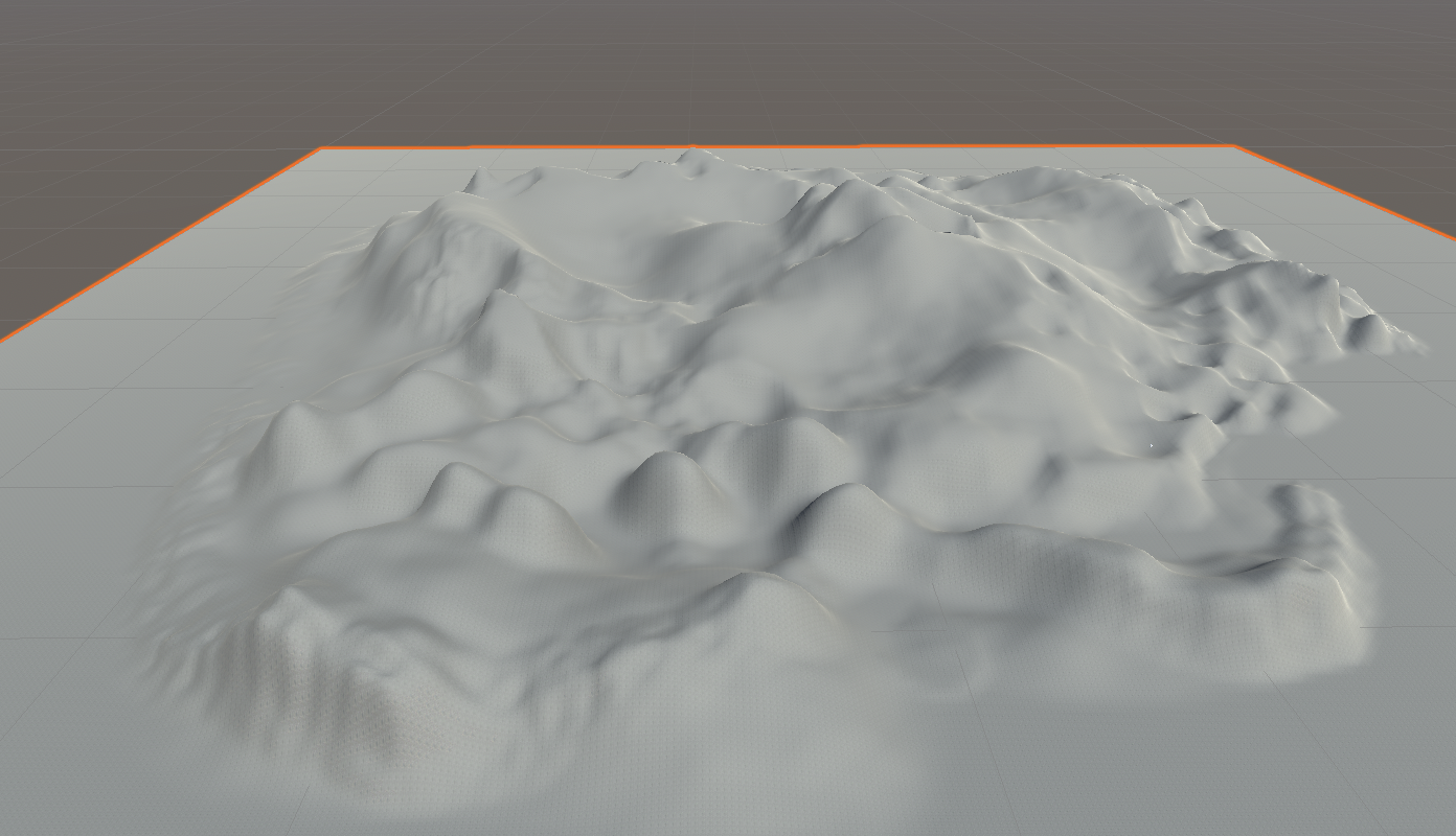
This morning I was able to spend some time quietly brushing heightmap details onto the terrain in the “bald patches” of rock and dirt so that you get a little more visual interest. Not entirely sure how important that is, but did run into some shadow-stuff where I’d accidentally create a more drastic shadowing effect on the terrain than intended and then would fight with it. I wrote a bit about that in the commit and the whole terrain casting shadows on itself thing is clearly something to note.
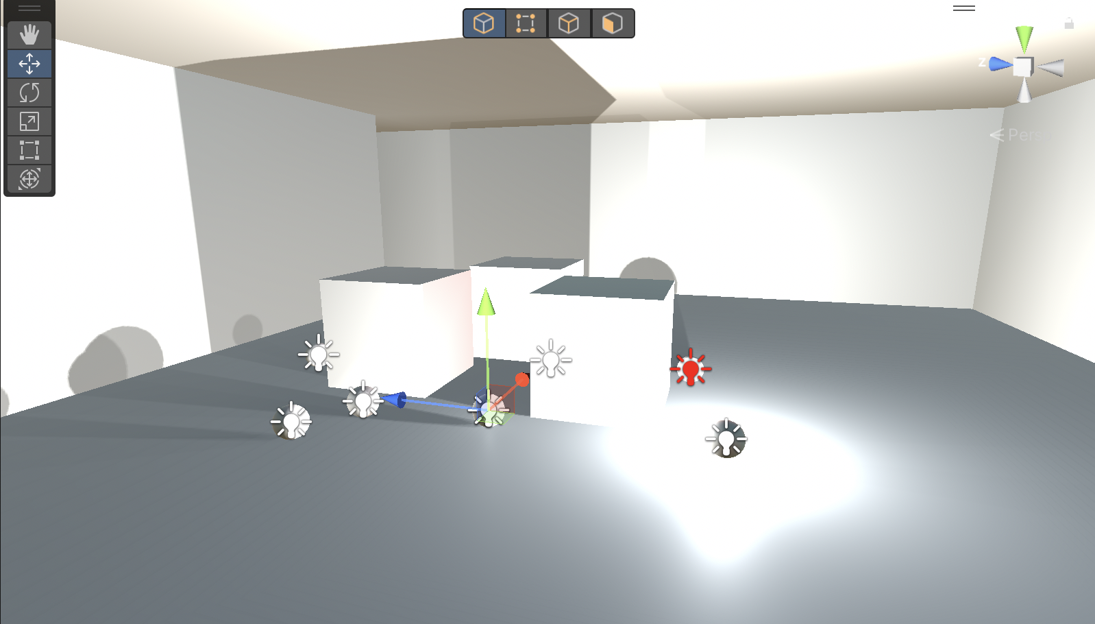
After doing that I happened to zoom upward and then realized it would be smart to take a look at the layout since I now have two prototype buildings on the island that give me a sense of how much room there is/isn’t for the buildings (and other structures) on the island, so here’s the image of that:
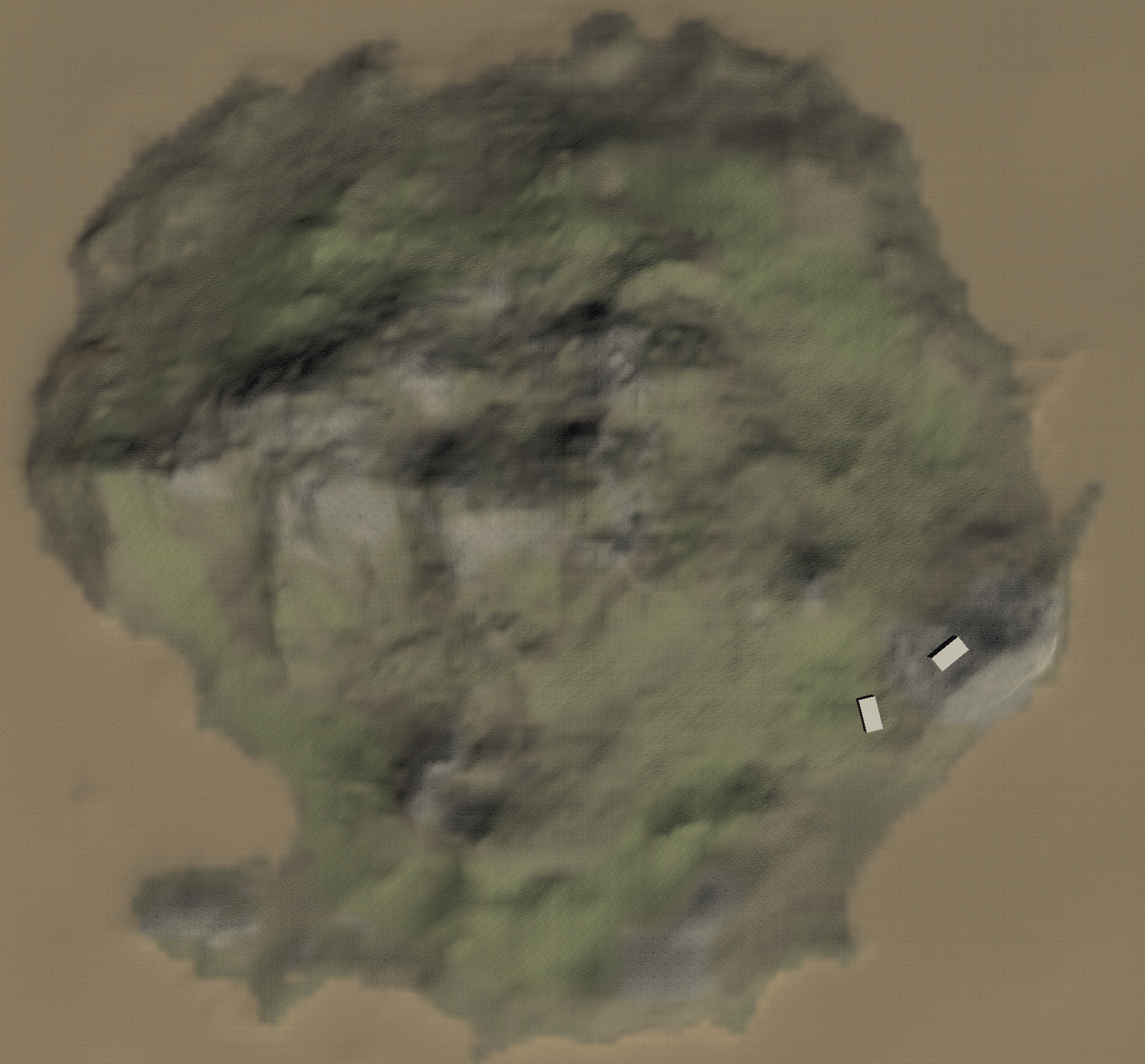
Well, so it feels like there’s a good amount of space for combinations of buildings and other installations, as well as to just let the “land be itself” as well - don’t want it to be totally cluttered.
As I think I’ve already mentioned there’s a whole correspondence to the Quist stuff in Schön’s The Reflective Practitioner where these buildings are of course going to be “in conversation” with their setting. For my level of sophistication (low) it will be a pretty dumb conversation where I’m just trying to make them sit right and look non-stupid. It’s currently my intent that all the buildings would be “the same” (maybe with small mods like a window if that’s the idea etc.), but I wonder how boring that gets and how much that causes trouble navigating.
Which also brings up questions of labelling and wayfinding - do I want a map? Do I want to number or letter or something the buildings to distinguish them?
But yeah if all the buildings are the same does that kill the mood a bit? Or am I just making myself trouble? I suppose to the extent that I become “extremely good” at probuilding this kind of simple, brutalist, concrete form building I can make custom ones as it pleases me - maybe even “in conversation” with specifics of the landscape.
I know there’s a “make holes” in the new terrain stuff I haven’t seen before which opens up the possibility of
- Buildings set into cliff-faces perhaps (that museum in Tasmania?)
- Actual caves (I brushed past a reference to Plato’s cave the other day which is obviously a major “shadows” reference as well)
So I suppose I want to say here that it has been very generative spending some time with the terrain even though my initial thought had been “grab an island as is and chuck stuff on”. I’ve enjoyed learning the tool, it’s been very satisfying building something “of my own” (with inherited components from the Unity Store Asset), and there’s a lot of “shadow stuff” involved that I might not have realized so easily otherwise.
In short, project continues to go well in these dribs and drabs of time I have. Next up it probably returning to probuilder and trying to make a non-seamful room.
Shadow acne, 5 o’clock shadows, shadows everywhere – Thursday, 14 September 2023
Just wanted to drop in after the last commit to reflect a touch on the whole shadow acne issue. Specifically, was reminded (by seeing it) of shadow acne and how it happens and how you can attempt to control it most of all with the bias settings on your shadows.
But everything has knock-on effects, and everything is extra meta because at base the game is about shadows and… well whatever the shadows are doing is still very much a reflection of shadow technology. It’s just that in making a nice looking island and working on clean-looking brutalist rooms for things I’ve inevitably become attached to the shadows looking “nice” rather than… whatever, just “the way they are”.
Because if your bias is low, then you get shadow acne and thus the walls and surfaces look really pretty weird and gross. That remains a consequence of shadow acne, but still.
BUT that does make me think: well, you could literally demonstrate shadow acne in one or more rooms right?
AND in the same way you could demonstrate the bias value in another room, the way casting shadows can be radically changed. Bias and normal bias too.
BUT that starts to get very inside baseball, very parameterized (v r 3-ish) and I begin to wonder how to explain that? Informational plaques that try to give you a sense of the point without being too detailed? I suppose so.
AND as above, too much bias leads to “peter panning” where objects appear to float because their shadow detaches from them (that’s what the bias does), while too much normal bias leads shadows to be ridiculously small and weird.
And NONE of that looks naturalistic. And I think one of the problems I have with that is I’d like the exterior environment to look kind of “normal” and to keep the freakshow experiments inside the rooms in more controlled environments?
So I also experiments with hard shadows outdoors which seems to reduce the artifacting stuff a lot without compromising (much?) on bias?
And also while I was reading about these problems on infinite forum threads I was reminded that of course there’s also the whole universe of baking the lighting which means baking the shadows too, which might be a way to save a lot of heartache if (a) I could ever fucking figure out baking this stuff and (b) it doesn’t blow the size of the game to hell for web.
Which ALSO is a thing because the behaviour of all this in WebGL is another issue that appears separate. For instance when I “solve” the acne with hard shadows and a high resolution shadow map for the real time shadows, the WebGL version still exhibits what looks like a tiny line of texture fighting at the seams of the building. Maybe I can beat that with vertex welding? So many shitty little things to think about.
And again I stress that this is also funny and maybe an opportunity because it’s NOT MY FAULT that all these things happen: THIS IS THE TECHNOLOGY AT WORK and to some extent THIS IS WHAT I AM EXHIBITING. I thought it would all be beautiful and “aesthetic” but maybe I will also be demonstrating how shit things kind of can be?
So a frustrating, sort of funny if you squint, situation.
The fight continues, now with Blender! – Tuesday, 19 September 2023
Well I am still trying to figure out a way to make the room work in WebGL because the discovery over the last couple of days of fiddling has been that it might render perfectly well in the editor (and maybe in an application version? will have to check) but in WebGL there are other troubles.
The most troubling trouble for right now is that when I put a (separate cubes) roof and floor onto the walls of the room the seams are visible in WebGL - though not in the editor (and maybe not in the app). I cannot for the life of me understand why. Is it a texture thing? Is it an “edge-fighting” thing between the meshes? Do I microposition them separate? Do I then run into some other bullshit? Is “edge-fighting” a thing…?
Well no apparently, but I’ve read plenty of stuff maybe suggesting that my geometry sucks, which hardly surprises me. It would be nice I suppose to understand how to combine the whole thing so that the vertices etc. are all rational or whatever.
I also can’t understand (well enough) how to do the UV unwrap so that texture sit on these things correctly, but I suppose that’s for another day.
And on top of all that shadow acne is back in WebGL probably because of some other setting I added perhaps to do with the hard shadows or other stuff I was doing to try to solve … shadow acne. Fuck me.
Here’s an image:tThe left building is blender, the right is probuilder, shadow acne on both at a certain distance. Whee!
In amongst all this and as I think I’ve remarked but haven’t yet dived all the way into reflection-wise, is the ways in which all of this (well maybe not the UV unwrap and the seaming) is a part of how Unity renders shadows - what shadows “are” in the context of this engine. Shadow acne is shadows. That is, it’s a reflection of how the engine tries to render shadows - yes it’s “wrong” in the sense of not being naturalistic, but it’s also “right” in the sense that it’s the engine’s idea of shadows in these circumstances. So…
I mean I think I have to have shadow acne as a part of the project, in a room or illuminating some specific element outside. And because it’s quite a weird technical problem there needs to be an explanation. And that means I either need in-world texts (avoid?) or a PDF (easier, funny) to explain some of this stuff to the viewer.
And it also means that I need to let go (somewhat) of the idea that the island and its shadow will be by default beautiful as in the essay that inspired the work (In praise of shadows) and maybe I need to remove that from the title for that reason. It’s more about “in reflection on shadows” or something along those lines right because we’re trying to see the shadows as the engine understands them, not in some “artificial” (ahahaha, this is so weird) way where it’s only about naturalistic effects. It’s all about engines and realism and shit.
Oh, WebGL, why are you stuck in your teenage years? – Wednesday, 20 September 2023
Well I’m making progress, per the commits, but it’s been a long road to some kind of sense of being able to “begin construction” in terms of placing stuff on the island and thinking about the room-scale installation pieces.
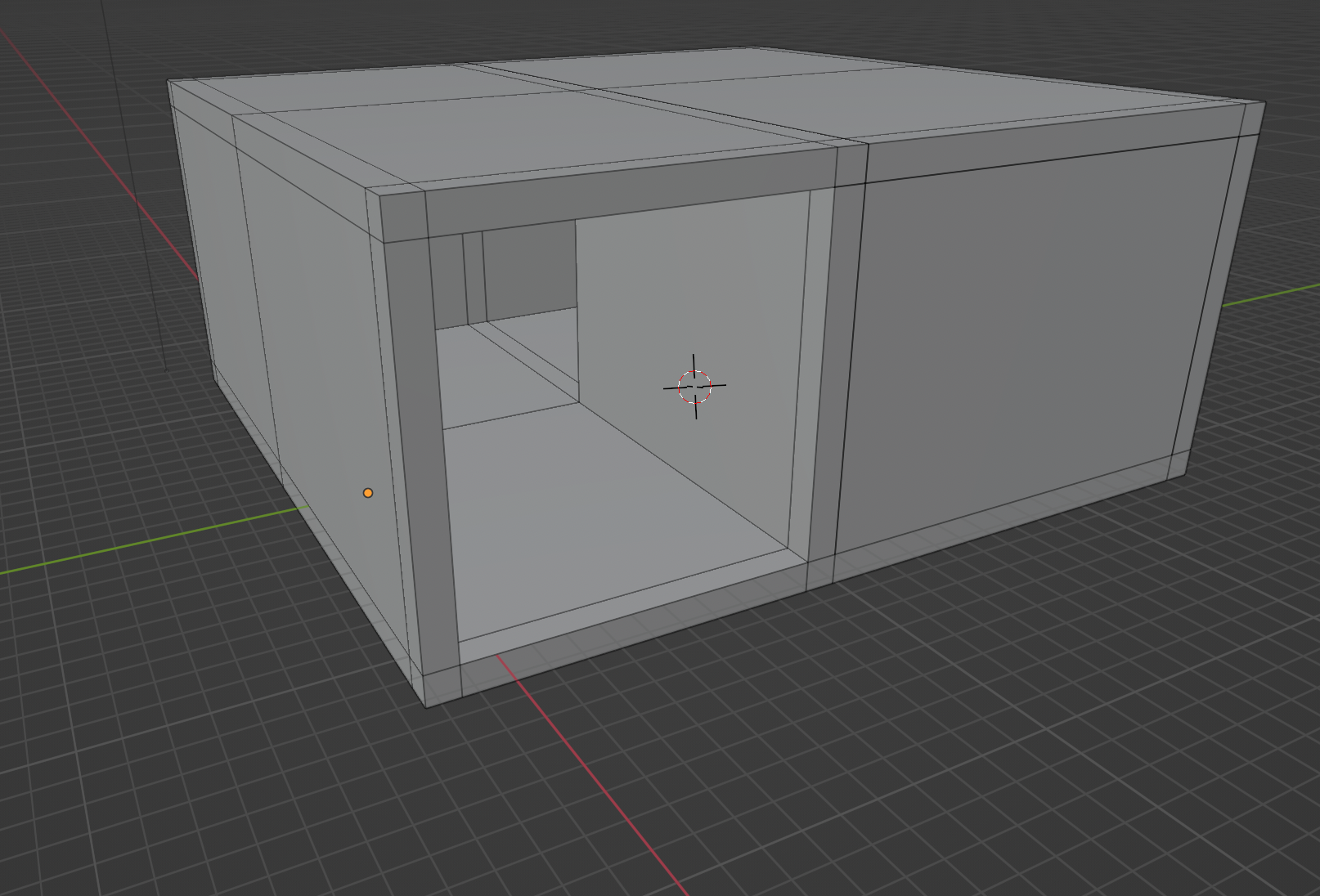
Importantly, in switching to Blender for a while and reading stuff about 3D geometry I was able to understand that my problem was emerging out of having mismatced vertices/edges in the earlier models that led to the weird seam effect. I still do not know why but I know that. Thus I started rebuilding the room thinking with “edge loops” that essentially helped me to make sure I had matching vertices where needed. It looks like this:
In principle I think this could allow me to return to a modular structure, but for now I just have the room as a single unit. Interestingly (?) this does make for an experience where I have to install/experience the curation of the interior light works from inside the room - no lifting off the ceiling and floating on high. On the one hand this is going to be cramped and inconvenient, on the other hand I kind of like the reference it gives to really doing this in person and the kinds of perspective you’re forces to have – a classic tension in making games versus playing them in terms of how you’re situated relative to the world, god or person.
Having done that I was able to translate the Blender stuff back into ProBuilder (edgeloops are there too) so that I can again make the room in ProBuilder, which I feel more comfortable in. And hey presto I do have a room that doesn’t show those cross seams.
BUT the new fun shitty thing is that the room (and all meshes) have heinous shadow acne in the WebGL builds, like this:
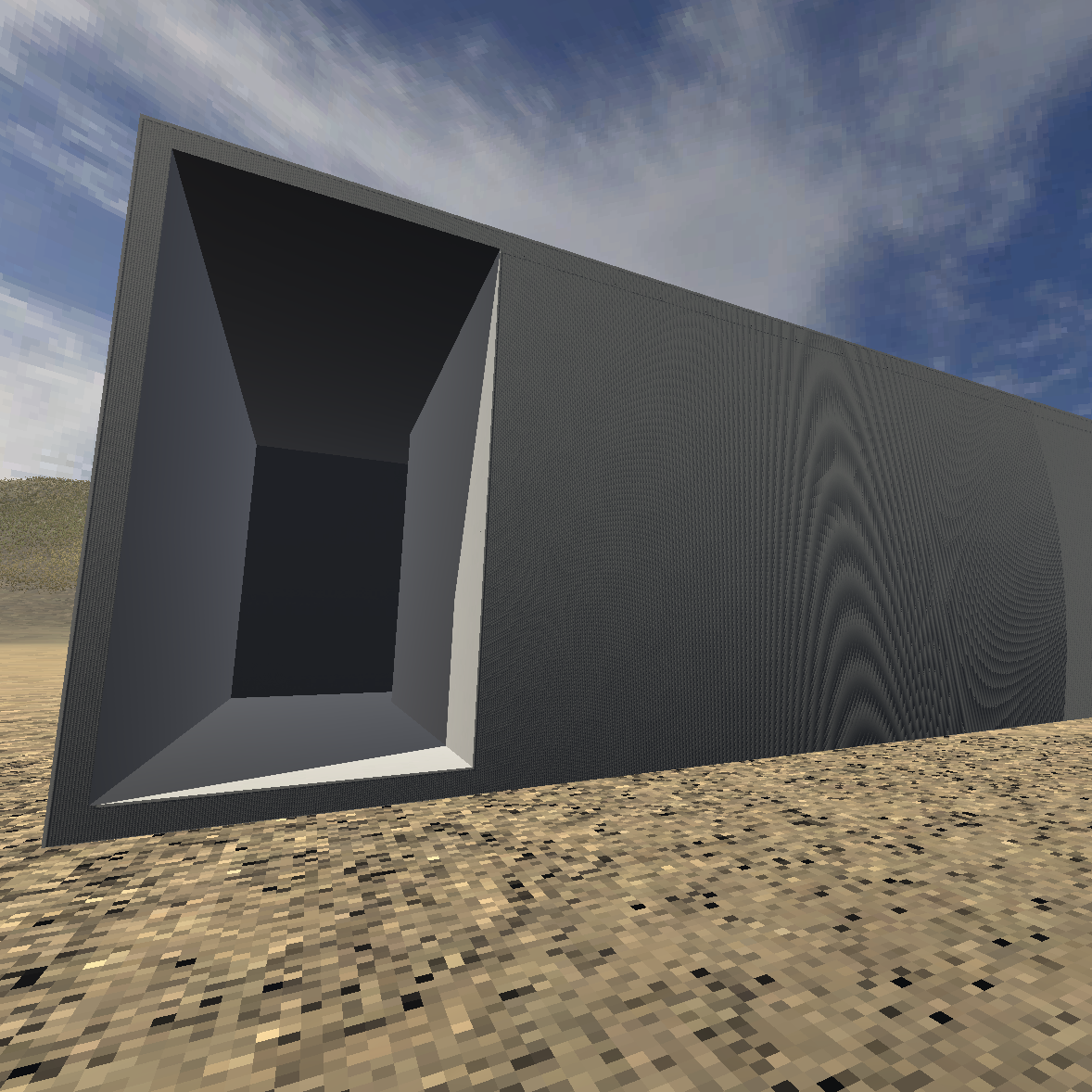
Edge-loops can’t save me now apparently. Note that this acne does not show up in the editor. Haven’t exported an app version but I’m willing to guess it won’t hit there either. To which extent there might be a quality setting I can try to force in WebGL that might ditch it? Alternatively I imagine it could just be back to the drawing board with bias and hard shadows stuff with the idea that I can find settings that work in the WebGL build (I suppose I could even just have totally different build settings on that front).
And of course it’s a continuing reminder that the shadow acne looks kind of cool and Moire-ish. And that I’ll want to do that on purpose. But I ultimately want the exteriors to have as little non-naturalistic lighting and shadows as possible as a default. I like the unnatural stuff to be at least somewhat under my control. Control control control.
Fuck you webgl / Settings mania – Thursday, 21 September 2023
I just want to jump in very briefly to say that it has been really hard trying to understand WebGL in particular relative to shadow behaviour (and probably other stuff but I’m fixated on the shadows for obvious reasons). I spent a bunch of time today, but also just over the weeks(?) I’ve been doing this trying to figure this out. I of course thought initially when I got it looking alright in the editor all was well, but also of course no - webgl is a different animal and that’s the limping impala I need to care for in my game engine animal nursery.
Anyway just wanting to remind myself of and give a sense of the sheer amount of research and failing one does in these situations. Things I have looked into at some level as a potential help when trying to understand how to make webgl look alright (haven’t tried all of these, it’s ongoing)…
- The camera’s far clip plane - somebody somewhere said that might help, but I don’t really see why. Obviously you wouldn’t end up rendering shadows in the places where the world doesn’t exist, but it doesn’t make sense to me this helps anything shadow-wise…
- The shadow distance - more likely in the sense that it’s about how far away shadows render, and I’ve seen some oddities if it’s super far where the terrain gets really inappropriately shadowed in flashes so I guess there’s something going on with this one. If you set it small enough you don’t get the flickering simply because you just don’t see any shadows, but I really do want shadows visible at some distance because… well I guess seeing shadows at some distance away is part of seeing shadows.
- Shadow cascades - actually nobody suggests this is an issue but I also have no idea of what they are. What are they? Let me find out right now… okay it’s about using different shadow resolutions based on proximity to the camera, which makes some sense. The default seems to be four cascades (four different sets of resolutions).
- Camera-relative culling of shadows - Unity’s manual claims this reduces shadow flickering but I haven’t the faintest idea if that’s true. I turned it on and didn’t see much of a difference.
- Bias - Yes good old bias is a major one for reducing acne but I don’t think it seems to be helping with flickering or distance-acne? There’s bias and there’s normal bias. And of course if you set them high the shadows look ultra-fucked in a different way (detached and totally unrealistic) so it’s not an amazing solution. But avoiding up-close acne is important it’s true.
- Shadow map resolution - I assume this is about shadow crispness? Would this be about flicker - hard to understand. I set it as high as possible assuming that would be best, but of course setting things high isn’t necessarily good since it can impact performance in non-performant platforms like… webgl.
- Render pipeline - I started using the default rendering pipeline but read at least a couple of people saying that the URDP which is, what… Ukrainian Revolutionary Democratic Party… no… it’s URP which is Universal Render Pipeline… which I think is just… newer? Some people have said it didn’t work in webgl, some people have said it did. Can you change rendering pipeline midstream? Perhaps I will find out.
- Hard versus soft shadows? - I assume hard shadows perform better but seem like that might be more vulnerable to artifact stuff? I don’t know. I had thought hard solved some big problem I had, oh maybe it led to not needing high bias, but then that wasn’t true on webgl? I forget.
- Shadow reflections - I don’t even know what the fuck that is, but it’s a setting. Maybe it isn’t? I feel like I have seen it somewhere.
- Quality settings in general - There’s a whole thing of whether to try to force webgl into a single set of quality settings to control what’s up, versus that just breaking on various platforms. It’s totally possible plenty of settings not obviously named after shadows or camera or light-specific stuff still have an impact (anti-aliasing??)
- Colour space - I think somebody mention going from linear colour space to gamma or something and it helped but introduced other problems
- Distance from world centre - The idea that shadows and stuff are centred on 0,0,0 I guess? Is my terrain/island centred there, could that help? I should try that. Unity also helpfully suggests just shrinking your world to make it easier on the engine but what does that do to other stuff I wonder? If everything is half as big what kinds of knock on effects are there?
- Temporal antialiasing - Don’t even ask me what that is. Somebody mentioned it and I think it’s some sort of addon.
So there’s a lot and of course these things all potentially interact so it can be very hard to know if one thing is making a significant difference.
And there are plenty of other things I fiddle with I’m sure but I’m just trying to give an honest profile of how much scrambling is often involved in this kind of work - compromises, failures, realizations, re-realizations, crushing realizations.
Here are a bunch of links to webpages I read while thinking about this and trying stuff:
In the end I have something going on? Like it’s not painfully shit?
- https://community.gamedev.tv/t/info-common-webgl-issues-and-how-to-fix-them/58841
- https://www.reddit.com/r/Unity3D/comments/griwnj/urp_and_webgl_shadow_is_blocky/
- https://forum.unity.com/threads/which-renderpipelines-work-with-webgl.1207846
- https://forum.unity.com/threads/webgl-lighting-tips.1092832/
- https://www.reddit.com/r/Unity3D/comments/p5nhs8/does_anyone_know_why_my_shadows_keep/
- https://forum.unity.com/threads/directional-light-shadows-flickering-issue.672094/
- https://docs.unity3d.com/Manual/shadow-distance.html
- https://docs.unity3d.com/Manual/LightMode-Mixed-Shadowmask.html
- https://docs.unity3d.com/Manual/UnderstandingFrustum.html
You know? Now you know. Anyway I’m just being honest here, this is what this work looks like sometimes and it can be hard to capture in documentation because it’s just such a frenzied screaming rush of infinite websites and parameter tweaks you’re obviously not going to repeatedly commit.
Real Gaps and Real Lights – Monday, 25 September 2023
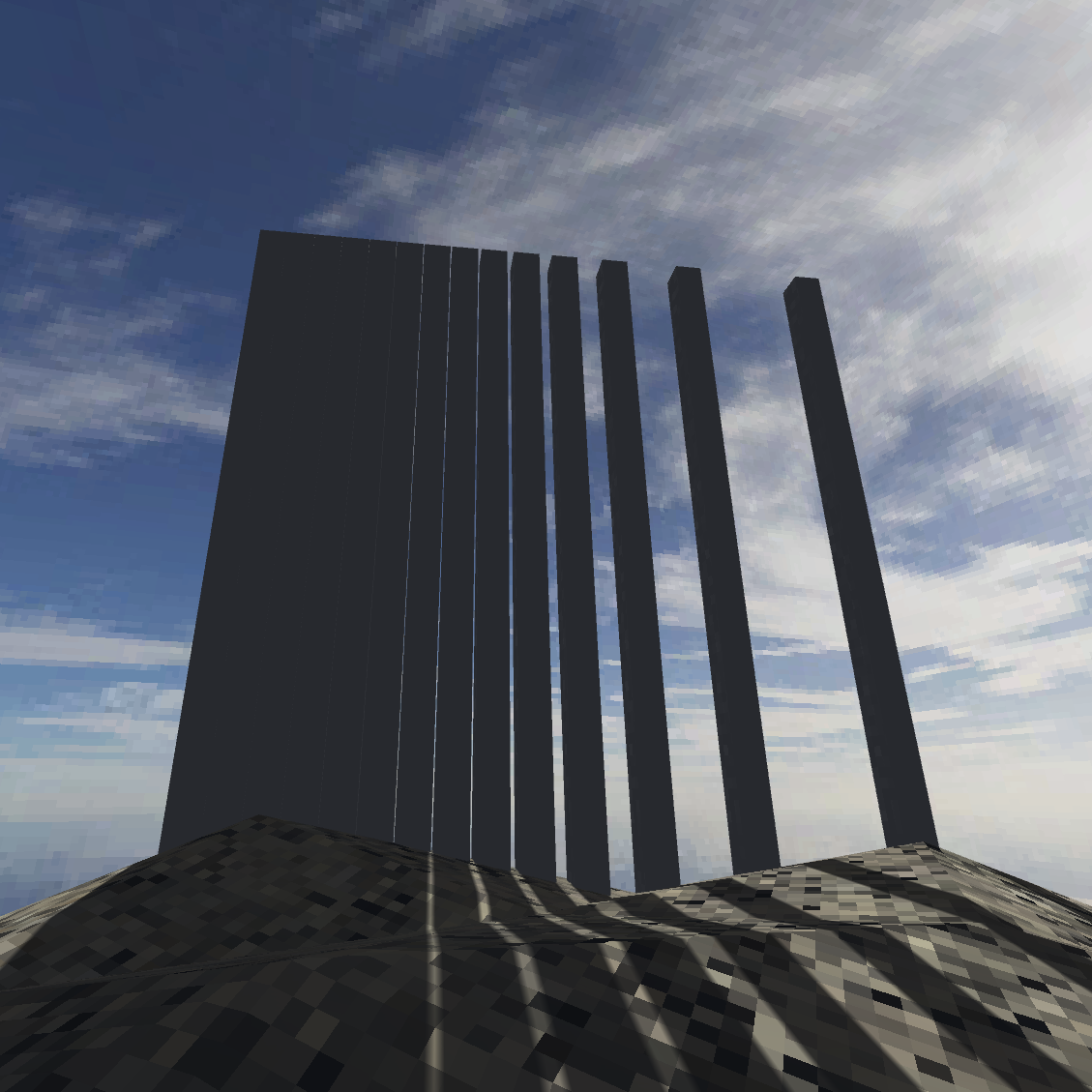
Spent time today biting the bullet and trying to “start”. After a brief dalliance with and then backing away from the URP I tried to make a couple of ultra-simple exhibits. That is, first of all
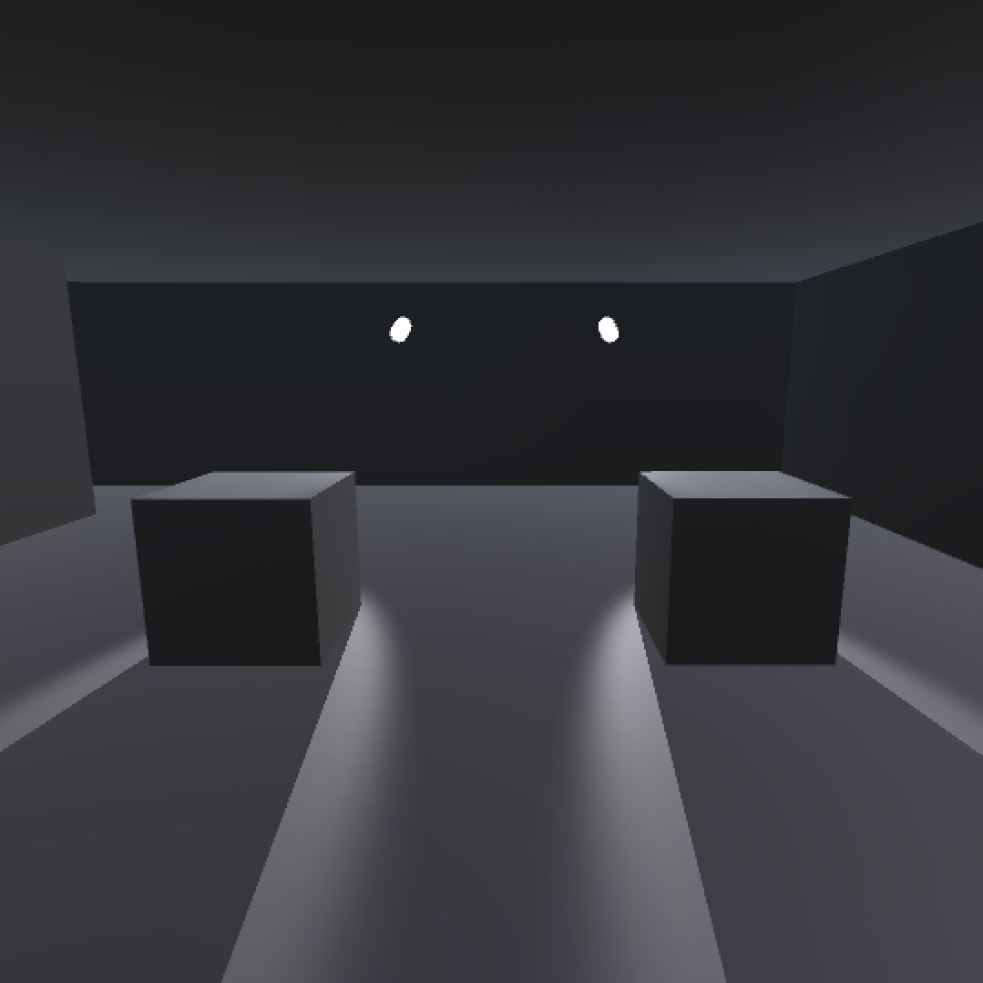
A series of poles with a decreasing distance between each one (half as much each time) until you no longer see light passing through them. In retrospect I wasn’t quite as scientific as I’d like with their positioning relative to the sun (they really need to be precisely perpendicular to prove the point). But generally speaking the idea being that there’s a moment where light stops passing through gaps in Unity and therefore what’s on the other side becomes shadowed despite there being optically a gap for light to pass through.
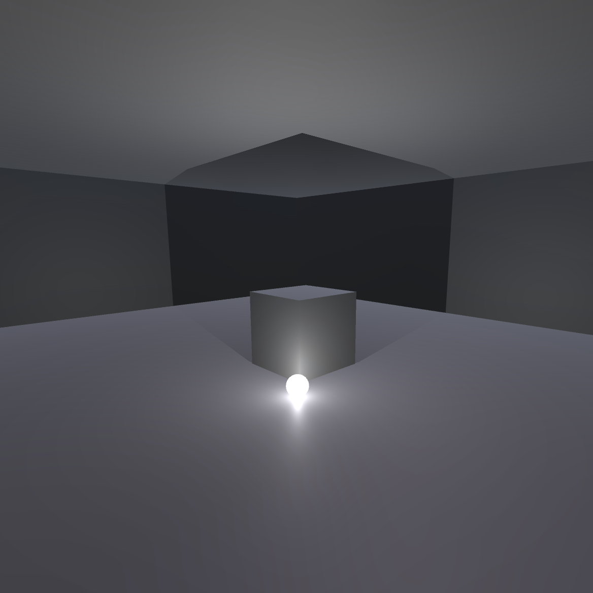
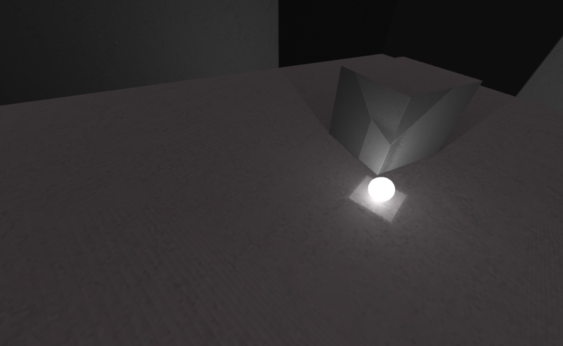
And second of all a room with a cube in the centre (well, by eye and this is of course making me think about how I’m not easily hable to measure to the centre and perhaps I should figure that out? A little marker?). And a pointlight on one side that casts a shadow into the corner of the space which create a sort of shadowcube based on the way it falls on the corner’s structure. It’s not something I was actually looking for but just came up when I placed the light and moved it around, so I’m happy about that. It felt like a mini-Turrell moment?
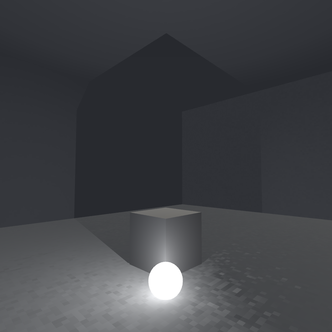
In doing it, as I mention in the commit, I decided it would make sense to give the light a presence in the space by creating an emissive sphere to show where it’s casting from - it just makes things more legible and is quite satisfying visually.
Having made a sort of start like this I’m immediately conscious of the potential need (or no need?) of a sort of taxonomized approach to all this versus just going with more impressionistic interactions with the shadow system. Like there are things I do want in there, but do I need to really measure it out closely? But if I do that I don’t know how possible it is to maintain… like the directionality of a shadow makes a difference - the corner versus a wall versus “just” the floor and on and on… to such an extent I don’t know that it’s going to make sense?
Alternatively though will I simply run out of ideas? Pretty clearly I should take a beat to start mapping out what the installations and rooms I might “need” relative to the properties and nature of shadows in Unity? Yeah probably that’s what’s next. Plus there will of course be discoveries along the way (like my Turrell cube or the Very Long Shadow down a hill).
Building buildings – Friday, 29 September 2023
This week I’ve managed to actually start a pretty comprehensive list of works and work on some of the simpler ideas around interactivity in the world (diases you stand on to affect the sun). Overall this has made the project seem pretty doable.
My current concern/annoyance is around the (non)modularity of the room, which I think I should try rebuilding in multiple pieces (notably at least ceiling an floor?) in order to be able to manipulate the dimensions a bit more easily. Just now I was trying to see whether I might be able to simple select one end wall and the pull it to make the room longer, but it hasn’t felt very achieveable and I suspect I’ll want flexibility both for the purposes of different display types and to just avoid a kind of monotony with the forms on the island?
It’s not quite easy enough to “whip up a room” every time I need one I think? On top of this stuff though I’m a bit unclear on whether just having better-matching geometry might have solved all my prior seam issues… in which case is there some cute modular way to make those rooms out of pieces and not ever worry about building them by hand?
How much should I let this bother me? I quite like the idea I wrote somewhere of also just changing the architecture a bit as I fancy, having sloped roofs or high ceilings or whatever… like it would be nice to be architecting a bit?
And are there better ways to contruct something like this? Like it’s better to subdivide and make holes and stuff?
Also just aware of a tendency to maybe try to find imperfections and problems to avoid construction. But also aware that if you jump into construction you can find out quite late in the game that it would have been way better to do things another way instead of the shitty way you did them.
I guess the big questions are
- Bespoke buildings (could be fun and I suppose I’d get better, but it’s conceivably this adds weight/size/meggage to the project?)
- Kitset buildings (if I could figure that out? It would require all the matching vertices stuff which is non-trivial?)
- Just one building, or maybe like three or four kinds of buildings and I could conceivably tweak them just a little bit as needed? Like an L building, a square, a longer one, that kind of idea?
I suppose having just written it I lean toward the idea of a small set of repeated buildings. Totally bespoke may just lead me down the path of trying to become an architect which I am not.
WebGL water, shadowplay, kitset? – Wednesday, 4 October 2023
Yesterday I managed to poke away at the game during my programming course’s studio time. Actually I also showed the class some of the (very simple!) programming in the game as it stands to try to give them a sense of the parallels between something like JavaScript with something like C#. But I did find out why the water looked like this in the WebGL build initially:
It was because of some material assignment stuff. I played with a good number of other things first, but the the thing that fixed it was noticing that the water’s plane had two materials assigned to it, leading to some kind of texture fighting I suppose? Anyway, when I deleted the second material I got back to this:
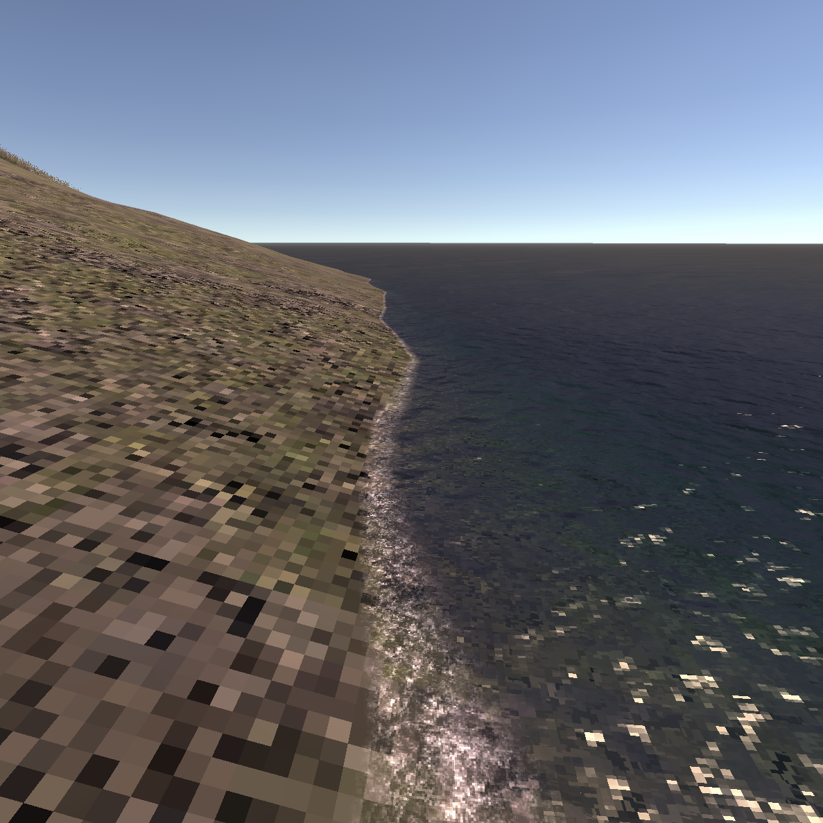
Weird the problem didn’t exist in editor or application, but maybe it’s just smarter about that situation for some reason. Anyway, now the water is actually established and I don’t need to fret about that aspect of my fancy naturalistic environment.
I also switched to Unity’s default skybox because it bugged me that the sky didn’t darken when the sun when to nighttime. It’s now as nicely pixelly now but it does respond. If I have the energy I can look into making a reactive skybox that has my beloved pixels. But realistically I dunno because as soon as you have a cloud or something (that shows off the pixels) you’re going to expect the clouds to move if the sun moves and then you screwed. I suppose I could have meshes for clouds, but that’s… well actually the shadows of clouds moving across the terrain would be kind of rad? Uh oh. Well I’ll think about that.
The other thing I did was play around with the spotlight idea, having a dias that turns on a strong spot. Spent quite a while feeling it didn’t work (didn’t seem to cast a shadow of my building) before realizing the shadow was getting washed away by the sun light source. So there’s that aspect of shadows too… a shadow for one light can be cancelled out by another light. Which is kind of interesting really and probably worth demonstrating? The vulnerability/dynamics of shadows?
I’m feeling a bit of inertia in the project right now and it’s almost entirely because of the dragginess of building rooms. I’m wondering again about going modular and what that might take. I could even look at that BBlock kit I used v r $4.99? Like could I make a little “easy to use” set of walls, floor blocks, door blocks, window blocks, and just clip togeth a room? What happens to the texturing in that situation? Will it matter? Maybe I will try this out today.
Death to kit sets – Thursday, 5 October 2023
Spent most of my allotted time today desperately trying to be clever about creating reusable pieces for constructing rooms, even to the level of giving them edgeloops and stuff that was meant to make it easier to align vertices. But noooooo, it was not easy and it did not work. I was quietly confident but there were weird texturing issues, texture fighting, seamy stuff, and so on. So… fail.
It’s probably possible to do it that way, and I did read some stuff about this process online, but I was never able to truly understand it.
To which end it looks like I need to do something like:
- make one or more original buildings (e.g. a square, a long one, an L one)
- Use them repeatedly to create some level of variety
- Edit individual instances of those buildings to give a little bit of visual change-up like slanted roofs, or bevelled doorways, or whatever else might be fairly easy to do
- Explore embedding a building into the terrain as well, seems a cool trick and I’d be keen to see it
So time to brush up my probuilding obviously, but I think even from the last time I probuilt a room it wasn’t all that arduous once I was on the trail of edgeloops and stuff to avoid the seam stuff, and by keeping it all in probuilder out of a single shape (extruding etc) I’m then able to keep the texturing consistent. Could also be trying to do all this in blender but I don’t see the need.
So this project has definitely been a ton about hitting my head against 3D geometry, but that does make sense since that’s the stuff that… casts shadows.
Molasses – Wednesday, 18 October 2023
Definitely a bit molasses-y with the game for the last bit… kind of shocked/depressed to see my last journal entry being two weeks ago, though in terms of commits etc. it’s been more regular than that.
In essence I’ve continued to get caught up in the building game. But with the upshot that I think I’ve made a few decisions that will be helpful long term. Specifically:
- I’ll be damned if I can figure out how to make a nice L-shaped structure, but also: fuck that structure. I was only going to do it for variability of shapes and I think I can do that in different ways…
- … like instead modifying some of the exterior details of the basic rectangular building which I’ve found out I can manage mostly without instane artifacts (light leaks especially) by duplicating faces and then building extrusions etc. from there, leading to what I hope will be nicely varied structures.
- I have become good enough with ProBuilder to at least easily alter the dimensions of my rectangular space, which might well be good enough. Tall ones, flat ones, long ones, square ones, and then with external “flair” it should be good enough.
- That approach also means I can essentially just install everything in totally vanilla rooms and just modify them later as needed, or as I realize the building dimensions need to change to meet the requirements of the install in terms of stretching or shrinking
Anyway, I’m claiming in this moment that I will simply stop trying to be fancy and will instead focus in on just using the building I have.
ALTHOUGH, one big proviso: fucked if I can figure out how to make a window? Oh well.
Let’s get this party started sometime – Tuesday, 31 October 2023
Wow I’ve let a lot of time go between journal entries, which I guess partly tells you that I’ve somewhat been spinning in place. Or perhaps at least spiralling outward in place? I do think I’ve managed to do and learn a lot in the interim (see commit messages) but it’s also true I haven’t really advanced anything visually.
Consider that I took a couple of screenshots today to show the current state of progress:
Which… well it’s progress in terms of the ways in which behind the scenes the room was made in Blender and appears to sustain 0 bias nicely, or how it’s prefabbed with entry and exit triggers tied to the lights, or how I tested probuilderizing it and extruding some of the surfaces successfully.
But it’s also just hilarious that these are pretty much the same two screenshots I posted in late September. So a month of battle with 3D modelling, UV unwrapping, the lighting system in Unity, prefabbing, and more. But… I kind of feel like I have, finally, come out on top?
To which end there’s no reason at all not to start the install. Fingers crossed that is true, because it’s starting to feel like I’m satirizing someone who just can’t quite get started on their project.
Production Mode === Question Mode – Monday, 6 November 2023
Okay well I did start the install process as you will see from the commit subsequent to that previous journal entry. And as you might imagine when the rubber meets the road and when the hands get amidst the materials of creation and the shadows mingle… it got complicated almost instantly.
The windowed room was not so complex:
But it turns out that spotlit cubes led me down a path of understanding pixel lighting:
To quote the commit message:
Anyway it just feels like there’s some stuff opening out and I need to keep my eye on the prize of making it an interesting place to be rather than mostly focused on my own internal noodlings with the engine. So I still want exhibits that show what’s what, but I don’t want to get into the weeds on invisible things, or unperformant things, or etc. Okay? Okay brah?
In essence there are a lot of things about the engine itself and how it works that are interesting from one way of looking it (like a maximum number of pixel lights per surface/mesh) but are probably just not that interesting to a person visiting this island.
So what do they want? Well nothing much specifically but mostly to look at things that are… interesting, surprising, beautiful, poignant? And that in combination with my almost educational-orientation yields the game. Do I want to “teach” them that you can only have two pixel lights per mesh? I think probably not right? That doesn’t sound very interesting even if it probably can be in some way…
So I think probably a little revamp of the work list in this light, trying to think of cohesive displays that show something but are also just aesthetically worth seeing in in order in this situation.
And for the moment: no more than two lights on in a room, basically. And it’s probable I can achieve most of the stuff I’m interested in either by literally only having two lights in a room, or by setting up such that only at most two are on at any given time, though there could be more.
And the ongoing question: will I fill the island? Will I overfill the island? No fucking idea. Also what happens to the fil size when I have a lot of different buildings? Also… don’t know.
But for now a revisiting of the work list given new technical info and perhaps a mind more ready to do further installation having tried some stuff.
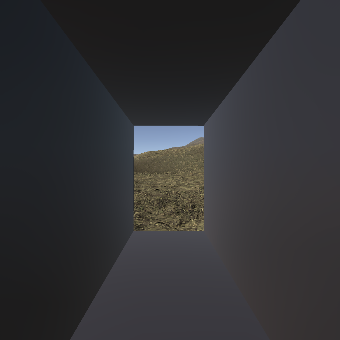
Failed tunnel – Thursday, 9 November 2023
A quick entry to document some invisible work. I spent some time this morning building a tunnel through the “mountain” in the centre of the island since you can delete individual terrain tiles and therefore make a structure that passes from one side to the other.
I actually made it pretty much all the way through but then ran into sizing issues around seeing the terrain gaps and also height differences at the ends in terms of whether the exit was above or below ground. These are things I can fix by simply starting again so I did a discard changes (I don’t want those holes in the terrain and I’m not totally sure how to get the terrain back in those spots).
So the result is that there’s no commit because there’s nothing there even though I did all that work - it just doesn’t make sense to commit the thing that will run but won’t work long term.
Tomorrow/today I’ll redo it with a better process. Importantly it feels like a good idea.
Successful tunnel – Wednesday, 15 November 2023
A note that I successfully built a new tunnel with the features I kind of wanted. As I noted in the commit one of the big re-re-re-re-realizations I managed to have was being at peace with how the engine renders shadows versus the question of realism.
I mean I think that’s a major generative tension both in the making and hopefully the viewing for this project. Realism versus Engine. Because it’s very much wrapped up in what Unity essentially projects as the objective (“this is realistic”) versus what is achievable without ridiculous trickery and hyper-specific modelling, lighting, baking, positioning, and more. So I’m happy with continuing along those lines.
I did grab a couple of screenshots of the bad tunnel just for the record:
The new tunnel looks much the same, it’s mostly just shorter and finally worked out. “I’m quite happy with it” now because it just does its job and doesn’t try to be more than that. I quite like the potential connection with that idea of the monk’s passage (or something? the thing from Christopher Alexander… with the windor in a transtional space) where the idea is for a transition to encourage reflection.
The Zium Museum Prototype – Wednesday, 22 November 2023
I’ve spent the last couple of my (too rare) sessions in Unity working on a prototype for my contribution to the next Zium. In short I’m planning on placing one of the standard buildings from v r 5 in a room in the museum and including an array of lights illuminating some number of cubes. The lights will turn on and off in a sequence to demonstrate some kind of combinatorics of shadow effects in Unity. That’s the dream.
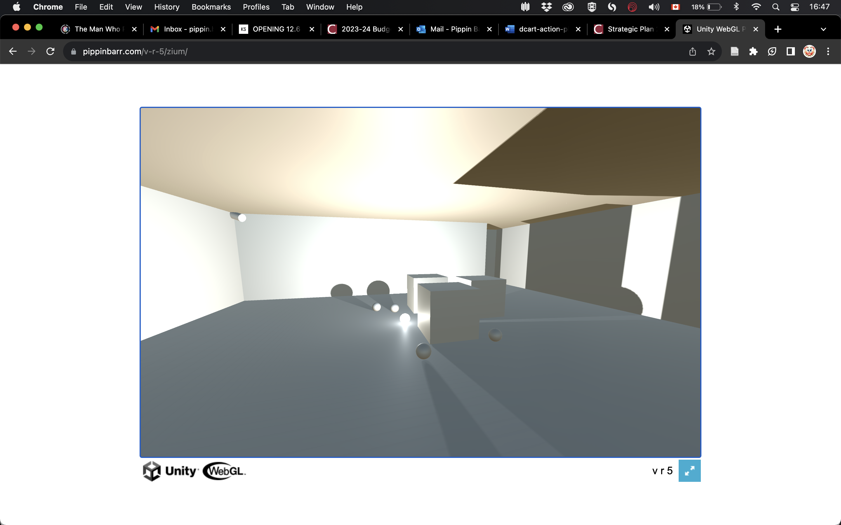
Right now there’s a pretty decent WebGL prototype in the /zium folder of the project that has multiple lights and so on. The scene itself looks like this:
And the room in play something like this:
It’s useful relative to v r 5 in the sense that I’ve wanted to explore that core idea of temporal sequencing of shadows (suddenly recognizing I need moving lights) anyway. So this gives me a chance to look at it.
I have to say that, having a working thing kind of put together I felt (as I noted in the associated commit) kind of sadly underwhelmed. I think some of that may simply be to do with general work vibes right now - I’m tired. Some of it may also be to do with the sort of ramshackle layout I’ve done of the lights and cubes, so that it doesn’t look very “professional” or whatever, something I can fix. But yeah is any of it ultimately like… well that’s not that great.
I don’t have an answer to this - I guess I have to magically be less tired, and fix the layout. I wonder, too, whether the lack of apreciable texture on the walls (something I’ve been struggling with frankly) is part of the problem. God forbid I have to take a look at that though. Texturing. I shudder. Maybe even just a bit more geometry on the walls? Some indents, some larger sense of concrete place?
Maybe the space simply feels a bit dead, not real. It’s not meant to be all that real, but it’s meant to be somewhere. These are things to think about.
I think that the fact of the Zium, the idea of an audience, the need to do a sort of vertical prototype in essense, is all helpful in addressing some of the questions that are maybe otherwise easy to not deal with during this sort of extended exploratory phase? The So what? becomes more apparent.
Back in the saddle? Or about to be bucked? (Monday, 18 December 2023)
Guess what? The Common Front and FAE unions in Québec have been on strike since 21 November which has meant Felix has not had school since then. What day did that land, you ask? Essentially right on my last journal entry and last work day on this project, because it’s been pretty well impossible to get anything done since then. With Felix at home there’s just not quite the same level of quiet that I feel like I need for this work.
That said, here I am, with Felix at home, trying to prove to myself I can do at least a little thinking and work every day to climb back into this thing.
In the interim I’ve been playing a lot of The Talos Principle 2 with Rilla and Felix and that has a really powerful sense of place. In a way it’s maybe making me feel worse about v r 5, but in another way it’s probably a useful inspiration while also being a… well I can’t do that so maybe I shouldn’t worry so much about things? Again the point is to see the shadows at all and then to see the engine’s relationship to shadows within that. My existing plan is fine for that.
I think that doing the ZIUM stuff has at the very least helped to demonstrate that sequenced lights (and their shadows) works fine for my purposes here and could potentially reduce the number of room structures around. But also that point about creating a bit more texture in the spaces is important as well - I think maybe having a more interesting approach to the walls would be good in general, perhaps just having the default space be a little more unusual looking, even if it’s repeated over and over, or even if there are just 3 or 4 styles of exactly the same layout?
Also we’re getting to a point where it’s also like… fucking hell let’s just finish it up and move on with our lives, this is not my life’s work. A bit early to have that feeling, but it’s possible this is one of those projects that kind of gets over conceptualized until it feels very dry and inactive. Probably that when I get back into really making it there will be more opportunities for surprise.
Definitely want to try out the whole “where you are on the island changes the sun” thing as I think that’s a much more interesting relationship to it and can situate different places in different ways. Also nice to think of seeing something in the distance which won’t look that way when you get there because of the light.
Also should try to just “have a bit of fun” with exterior structures? No reason that they can’t ALSO have dedicated lights with triggers around them to pull off different effects.
Anyway if I throw an hour at this tomorrow I’ll feel more in the saddle. The cosy cosy saddle. Of Unity.
I can do this. Right? Riiiight? Right.
Sun control – Wednesday, 27 December 2023
Well, it took more like a week to get “back in the saddle” but I did spend some time on this project today. The details are in the commit but I wanted to just stop in to keep myself on track thinking about how to finish this off because there are some deadlines involved (Now Play This, Zium).
The key-est thing is probably a combination of a really tight and definitive pass through the building curation where I just decide some of these issues around time-switching versus multi-object versus multi-room handling of different ideas. In my mind I would rather things stay pretty austere and contemplative. One observation I think I have from the early zium prototype (in progress here) is that cycle a ton of lights through with all kinds of effects kind of sucks the value out. In a sense you could say it loses touch with the motivating essay which is about a contemplative mood. Flashing lights are not that.
To that end, if I’m time cycling it should either be quite slow or it should be under the user’s control with buttons, room triggers, or something along those lines.
I remain a bit torn on UI/announcements/explanations of what people are looking at. I think without the technical language existing somewhere it could be a problem to understand any of the significant. The Zium prototype and Talos II but do quite a nice thing where they have a clear didact but it doesn’t have the writing on it, rather you focus the camera on it and it brings up a simple UI with the text. That would probably require me to include a reticule and I dunno about that or not. Probably fine but dunno.
So yeah. Next step is eyeballing the full list with some of these austerity ideas.
Traction – Wednesday, 10 January 2024
Time to reflect kids. Because reflection work makes the dream work. Writing down what has been happening and how I’ve responded to it is a big part of understanding how the design part works. Maybe most of all because you have your overarching perfect design idea (exhibiting shadows in a game engine) but the reality of that is a totally different kettle of fish, and when you actually engage with the materials (the lights, the shadow settings, the textures, the terrain, the architecture, and on and on) you learn things and bump into things and dislike things and worry about things and feel things and all that is what actually forms the meaning of the design, the expression of it rather than the abstraction of it. And all of those things are what the player eventually runs into and thus potentially has similar or related feelings and thoughts about. Or rather you choose which of those things to expose the player to, which you try to hide. And it’s the writing about it that, for one thing, actually records and helps you to remember what you were doing and how you responded in the moment. That’s more the commit messages obviously, because they’re allowing you to really just answer the question: well, what did I just do? But in doing that you’re creating a trace, doing the initial work of forming a response. And then here in the journal I can step back a little bit and think about… what are the implications of what I’ve been doing and learning through doing, how do things need to change to accommodate what I know now from a technical and experiential perspective? What do I want? And again it’s only by writing those things down that I can be accountable to the idea that my project needs to and has to and wants to change over time. If I don’t write it down… well it will change intuitively anyway, but I won’t really notice, it’ll just happen. And if I want to know what happened it’s got to be written out. AND it’s also the case that in writing things down, whether more immediately in commits or more intentionally reflectively in journal entries, design is happening. I’m designing by reflecting on what there is and what I can do about it. And because it’s taking place through writing (or drawing or whatever other form of explicit response I take on) it’s intentional design, accountable design, design that’s tethered to the beats on technical practice. And those are the things I want out of design - I want to know and notice what I’m doing, see the trail behind me and the weeds ahead.
That is, I have some traction again, I feel like I’m in the process again. It’s clear the repetition and the devotion of time and important time to the project that is doing this. I’m generally speaking working on this in the morning and for roughly an hour. I guess the commits will sort of bear that out, though they don’t show a start time. That’s actually a thing it would be interesting to track in a way, a sense of the actual hours of work. I guess you could fudge it into git with a commit right at the start of work? But no not really, it would have to involve artificial tagging and stuff. So let my description it just be there.
So where are we since 27th of December? Very distant. Most of all because I finally bit the biting thing and started just speed-prototyping all the installations. An embarrassing realization there was that I could prototype them all in the same instance of a room and just enable/disable thing, rather than thinking kind of literally and wanting to make every separate room from the beginning. Giving in to the idea that all the rooms will be the same base structure and so it doesn’t matter. Also giving in to the idea of prototyping the exhibits rather than needing to nail them down one by one. Which is to say, really fucking obvious stuff that should know by now.
BUT I suppose there’s a bit emotional component to being ready to realize something like that? Just how much should I beat myself up about it? How much of that readiness comes from all the previous work and just general mental stuff, and how much of it could have been churned out incredibly early? I honestly don’t know… my tendency not to beat myself up too hard about stuff thinks that it just needed to happen this way, but I could just as easily be wrong.
So, here we are with almost every exhibit planned and ready because I did that. The process revealed a ton of important stuff around what it actually looks like, it pushed on my continuing feeling that the spaces feel kind of dead and not very interesting. One argument there might be “that’s fine” because I’m literally just trying to exhibit these things and I can “let them speak for themselves” by just being there, but on the other hand there’s a question of curation and caring about the audience and wanting to shape a feeling that pushes back on that. If the point is to exhibit shadows and I want the audience to think about them and experience them as something worth witnessing, then just telling them “it’s about shadows” is probably only part of the work - people don’t necessarily have the capacity to sit there and look hard at the shadows and think about them. Worse, that’s not my experience of them in making the game - my experience of them is highly dynamic - I move them around, I see them changing and I have feelings about them because of that. Which is to say that I’ve more and more wanted just a bit more visual interest and maybe dynamics throughout.
This particular kind of realization was hugely triggered by a couple of key beats over the last couple of days:
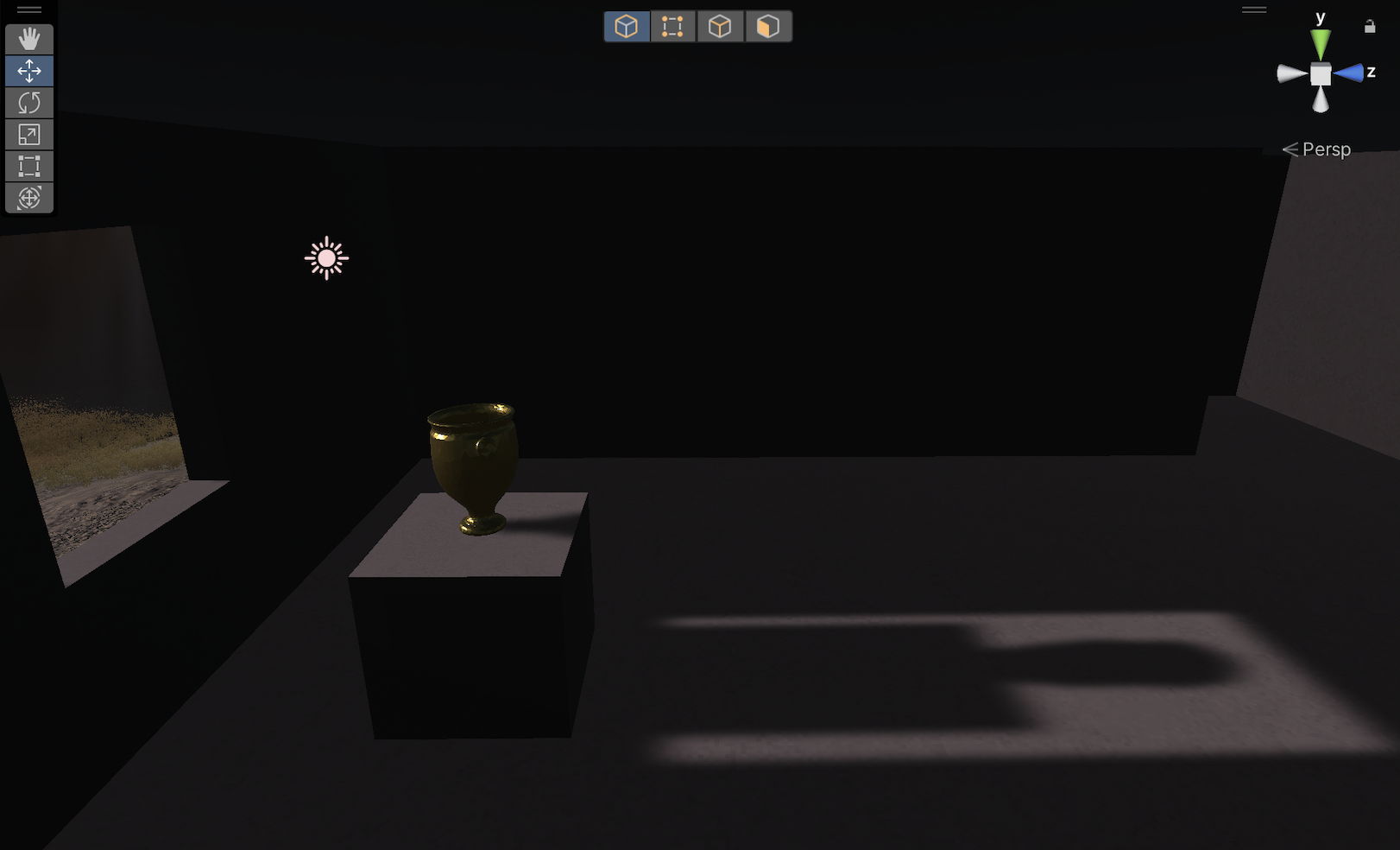
- I found a vase model on sketchfab to use as my “mesh shadow” example, which meant a whole process of dealing with it as an object, making it smaller, reducing its complexity (triangles, verticies) to work with its file size (don’t want to blow up the webgl build), situating it in the room on a plinth (cube), giving it a gold material so that it gleams in tribute to In Praise of Shadows. In doing so, it gave so much extra life to the space, made so much more sense of a shadow when it’s a more dynamic shape (not a ton, but enough), the gold texture stands out so much and makes for more visual interest, and so on. So I realized (I think) that the vase-on-cube should actually be the default scenario used to exhibit the shadows (instead of just a cube). So I need to go back through and do that when I make the real exhibits.
- I implemented the orbiting light, where a point light moves in a circle around the cube (sans vase right now, but it will be vased) and it was just so much more interesting to look at. Unsurprisingly of course, but it made me look at the shadows in a totally different way once they’re changing. You can still see their nature if they’re moving (have to get the speed right) but the movement somehow foregrounds the shadows, I suppose because the shadow moves and the object doesn’t (though I should have a moving object one). And this made me want to include some form of dynamic in all (or perhaps almost all, ça depend) the indoor exhibits. That might mean I “lose” the orbit as a specific exhibit? Since “light movement” on its own won’t really count if every light moves? But it opens the thing up a lot for looking. and that said you can imagine different styles of movement that have a lot of relevance, so perhaps it’s totally legit. Like circle, up and down, in and out, left and right. Right? And the movement also led to other dynamic possibilities - rotation (of a spot), angle (of a spot), brightness (of a point), color, all the various settings that I wasn’t necessarily even thinking about seem like they come into focus in this version.
And note that I had especially already thought about (2) a bunch in earlier discussion, but left it alone because it has started seeming too fussy and cluttered - but having experienced my world and my rooms and felt how static they are, it’s become apparent that it won’t be fussy in that context. I think even just small movements on some of the ones focused on something like shadow quality or hardness or acne will be nice… maybe just a slow pan or something. My brain is also asking me how this would actually look but I suspect it’s best not to think realism but just to put the light where I want, make it non-colliding, and let it float and move at will. I also think in this moment that if most things are moving then the ones that are static (like the sun through the window) will actually be MORE powerful, so it’s winny win win.
So there you go. I see the way forward. ALSO just a beat on the external sculptures – they will ALSO make more sense in the context of more dynamic interiors. Because they’ll be kind of… solid and stark in a way that I think is pretty cool. Still undecided on whether they too should have their own triggered lighting or not - but I suppose the answer is that they can and we’ll just see what it does.
ANYWAY, this is all good news so far and makes me quite quite happy.
Oh and just as a kind of visual journey since that last journal entry with any notes I can think of…
I tried out and succeeded at baking the lighting in a single room so we get to see what a baked area light shadow looks like. Need to think about the dynamic of how the thing is placed and so on (leaning against a wall like a mirror?) but very happy to see it working.

The continuing saga of me making buildings and remaking buildings and fretting about buildings. I have eventually made a lot more peace with this and I think I have a basic room size I officially like. I think a huge part of it has been coming to understand I don’t want many objects in there so the room scale needs to feel more intimate.
Yep, I keep just remaking this exhibit. Kept doing it until I realized I should power through the prototyping as above. This one was in the “correct for now” room size.
Managed to find a shadow acne setting that is really intense when it hits the cube - no idea what’s happening with it to be honest. This will be something to play with more, and something that will benefit either from animating the bias or more likely just moving the light around. Maybe a spot is more acne-ish? Will see.

The moment where I finally got the gold vase that changed my thinking about composition a lot. Isn’t it a beaut?

The orbiting light. It’s a smallish GIF so the artifacting of bands of light on the walls isn’t a real thing in the game even though I kiiiind of like it. It’s amazing to me how much this dynamic lets your pay attention to the shadows. Even the rotating light itself isn’t as interesting… I guess it’s something to do with dimensions of change? The plinth doesn’t move (though when there’s a vase I guess it will get different sparkles now I think of it) so it’s “last”, the light only moves in a circle with no other transformation, and then the shadows are the things that shift and change in their interaction with the walls and the shapes. Nice.
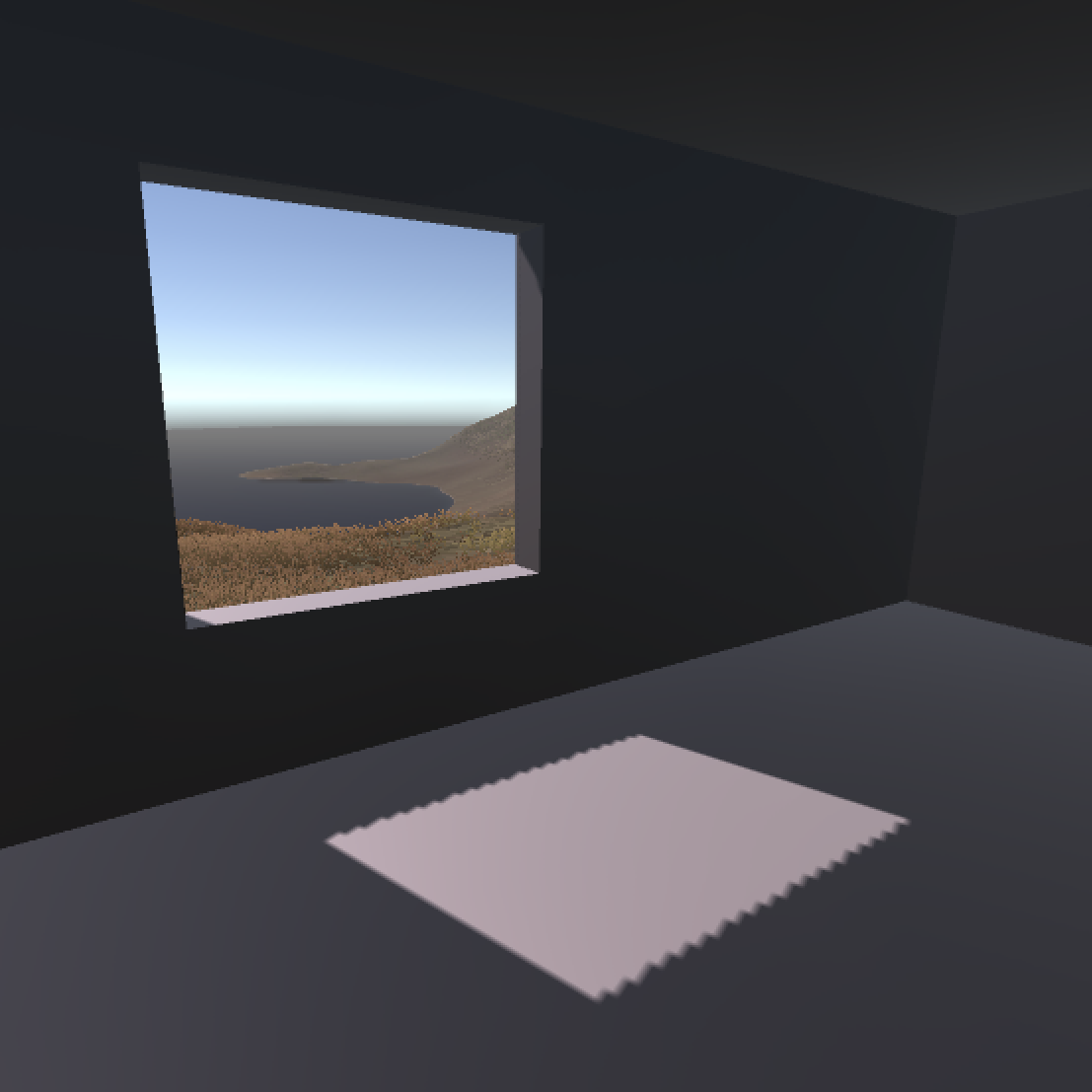
In remaking the window one it’s just so much better with the vase. Also because the angle of the sun needs to be really low to get through the window and cast a long enough shadow you get this neat dusk feeling. This will play well with the dynamics of the sun changing as you move around I guess. Actually this one feels like a small vision or preview of the In Praise of Shadows effect - the idea of a dimly lit but still lit room and the intimacy, cosiness, mystery of that.
But yeah. That’s my report. This might be the longest journal I’ve ever written at 2000+ words. A major unclenching.
The static and the dynamic – Tuesday, 16 January 2024
From commit 1f76970, yesterday:
- Need to make a decision on whether anything should be totally static (e.g. point light? or could we vary the light intensity or something in that case just to have something moving? Or should we have nothing moving? But what is the different between a point light that moves and one that doesn’t? And how to distinguish movement types like in/out, up/down, side-to-side from the fact of the light itself? Those behaviours yield quite distinct shadow behaviours, as do light rotations
- An orbiting light casts sort of the same shadows as a rotating object… but also not… there are weird subtleties. And how should I label things? It’s actually weird-feeling semantically.
This has been an interesting moment - there’s all the excitement of “discovering” the vase and the dynamic movement as a kind of default or much more common factor in the rooms; but to go with that is a sort of destablizing of the meaning of the rooms.
Previously it had been something along the lines of:
Here is a room with a plinth and vase and a light that cast some specific kind of shadow. (Where that could be a shadow strength, shadow acne, invisible object, clip plane, light type, and so on. E.g. a setting or a specific entity. Static.)
In that case it was fairly easy to separate out movement in particular as a specific form of setting or maybe a metasetting: here is a room where the light moves side to side, here is a room where the light moves up and down, in and out, wider and smaller spot angle, etc.
But now with the idea that it’s generally a good thing if (almost) every room includes at least some for of dynamic movement, it becomes hard to separate out here is a point light from here is a point light moving in a specific way?
There seem to be a few possibilities? Like one where there is a completely static point light…
- Totally static point light
- Side to side moving point light
- Up and down point light
- etc.
Or one where there isn’t that and the various kinds of point lights are just moving and we don’t foreground the movement
- Point light but it happens to be moving side to side
- Point light with low shadow strength but it happens to be rotating around the plinth
- Point light with no shadow casting but it happens to be moving in and out
But that doesn’t feel right because I think I do want to draw attention to the idea of light source movement as being a “setting” of a shadow - it completely changes how a shadow looks and feels.
But then do I fall into some “dangerous” combinatorics? Where I have to produce those forms of movement for both spot and point? (That’s leading to close to eight rooms just showing point and spot lights with different movements.) And where I have to have all of those with the default settings and the other lights with new settings but which also move in perhaps a gentler and more drifting way just to create some visual interest?
It feels like a lot of this is coming down to: should there be exhibits that forground movement (translation, rotation) as the “setting”, the raison d’être of the exhibit, the name of the exhibit… or should those different forms of movement be applied on top of a setting and the audience “just sees” the impact of movement as a secondary element, but isn’t explicitly instructed (by a title, by a devoted space) to think about the important/impact of light source movement on shadows?
Could imagine something more gimmicky where a light source goes through a full range of movements? Like it goes side to side, then up and down, then in and out, then orbits. Or you could imagine thinking that rotation + in/out + up/down in some combination could do the whole thing at once? And that the other (non-movement) exhibits just have gentle movement for visual interest? Just some drift…
But if I’m saying that gimmicky then… doesn’t quite sound right.
Just worked through another iteration of the list of works and maybe it’s not so bad? 22 total, including devoted movement rooms. And where the other rooms would have subtle/low-key movement. Or even a default like a very slow orbit perhaps - that might be quite nice.
Okay maybe I proceed with 22 rooms and we see. Maybe I should even do the “paste in 22 rooms and see what that looks like from bird’s eye. Can’t forget all the exterior stuff, though maybe there doesn’t have to be a metric fuck ton? Will see.
HmmmmmmmmDM – Friday, 19 January 2024
Just taking a moment to reflect on the project as it stands… actually just a grab bag of stuff I maybe should spend more time either thinking about or doing (because I don’t have time right now, gotta run baby!):
Memoing
I’m very drawn to this idea but I haven’t done it. That idea of separately fleshing out an idea that has come up a bunch or just very strongly? A separate process folder and system for tracking those things. It just seems incredibly valuable as an along-the-way distillation of what’s going on as you… learn what’s going on. But how to include it in a rhythm of development and documentation?
Whys
I’ve noticed that I haven’t done one in a bit. What triggers a why? When do you ask it? Are there obvious moments to do so. Should they be scheduled? They’re a pretty mega concept but such a good way to track the drift and adjustments of what the project is really doing instead of what I thought it was going to do.
Exhibitionism
Well not that actually but I’ve found myself thinking, perhaps especially because a couple of exhibition opportunities (A MAZE, unidentified online exhibition, Now Play This) are looming, about how you present the documentation - maybe especially when it’s even still in progress. I feel like there’s an opportunity and a danger associated with deploying commits and builds with an eye toward them being seen as a kind process art. Like, there’s extra work involved and it could be a distraction… but should I think about my documentation and process as part of the artwork and not “just” a separate (and valuable) documentation repository? My instinct is always that documenting should be easy and should feel like there’s no audience outside myself but… that might not be true. How performative and usable should my documentation be not just for a committed scholar (hi scholar, I’m sure you totally exist) but for more casually interested folks?
Screenshots
I’ve tried to be better at this but I can still feel how unsystematic I’m being. Should I have a rule that every commit comes with a screenshot? Would that be a way to think about displaying these things down the line? A sort of pictorial timeline if one wanted (which I could construct manually or you could imagine scripting). There could be a dedicated line in the commit message that references the screenshot like a caption. Or the commit message could just be the caption to the image in an alternate display form. Busywork? Good work?
Emotion
What is the role/value/non-value of including your emotional state in development documentation. It’s obviously “humanising” but is it genuinely relevant or just cathartic (nothing wrong with tht either). Sometimes I write these kinds of things, including just life events, sometimes I don’t. I feel like I usually deploy them as an excuse for a lack of work over a period of time, but do those events and feelings get expressed in what I actually make? Am I over or undersharing?
Re-realization: Tired or Wired?
In this project and in so fucking many projects I have this realization way too late that I’m bored because something about the project is boring and I need to fix it. In this case the “undisclosed exhibition online” (which I’m now realizing is totally disclosed in this repo and that’s… well probably it’s fine, I’m not shouting it from the rooftops) really rammed home to me how bored I was by my own exhibits. But the formalist in me kept going “fuck you, it’s a formal exhibition it’s meant to be boring”. I have this endless tension between formal rigour of my idea and the idea of someone actually experiencing it, how much of a “concession” to make. I’m kind of bored of realizing I’m bored. This feels like a major design thinking idea and moment, I should look into it. There’s probably like 10 books about it.
–
I should stop there and get moving. Thanks for listening, me.
Monday, 5 February 2024
Commit messages are the most consistent part of MDM.
To the extent the point is to be reflective about technical practice and the project in a larger sense in this message (and for me it is the point), they come at a perfect moment: you’ve just been literally engaged in the technical practice, you have seen yourself and felt yourself putting in the work, writing lines of code, adding elements to a scene, etc. There is really no point at which you have the project’s nature better loaded into your brain than right then, and it’s a good time to switch to an evaluative and reflective mode.
The tradition of efficiency in software engineering practice fights you though. When you write commit message in VS Code, say, it offers you very little space, usually a single line, or maybe it expands to 10. You can write more, but there’s a strong sense that the software and the software engineering world in general doesn’t want you to. That’s mirrored, too, in how github.com displays the commits: by default a single line, but expandable if you want.
Maybe that’s the point - we can think and write briefly, but it’s expandable if we want. Hey presto, reflection!
Under construction, seam hell – Wednesday, 7 February 2024
Hi there, just dropping by with some updates. Again in terms of MDM I’ve been finding that the commit messages are doing a lot of the work that I’ve maybe more traditionally used the journal for? Or perhaps what’s happening is that in this specific game, because the core design concept (exhibit shadows) is sufficiently simple, there’s just not as much deeper conceptual wrangling I need to do in a pause and a breath in a journal? So again most of the beat-by-beat design/technical thinking is very much in the commits - and this is in some ways the first time I’ve ended up thinking of the commits as the main story, with the journal being much more jagged and start-stop.
Nonetheless, I’ve advanced things a lot and now have a plane (as in geometry) floating in the sky on which I’m positioning individual exhibition rooms one by one as I add them. That caused me to go through a couple of technical iterations on how things work, most notably bringing in the idea of the Unity animation system (Animation Controllers, timelines) where it seems appropriate, giving me stuff like a GUI for determining keyframes and getting easing going and stuff. I wrote some kind of nice-ish modular inheritance-based stuff that allows me to attach different behaviours to lights that syncs up with the room trigger blah blah blah, it seems like it holds together.
I’m much happy with how individual rooms actually look now, but that too has had major changes. Most notably the idea of an active/dynamic light every time, even if movement isn’t the “idea” - so the basic pointlight drifts a little just to make the room feel like it’s alive. Also I’ve started positioning the lights in front of the plinth so that they (by and large) cast a shadow to the back wall, which has introduced other considerations (how lights should move, how far the plinth should be from the back wall, how the vase should be oriented) which has… broken my prefabs quite a lot - the whole thing is a bit of a mess in some ways at this point. BUT that’s maybe okay because there’s ANOTHER mess anyway which is
For some reason and as some point, the shadows/illumination levels on the building itself (built in Blender) has become utterly fucked! Like big square patchs on the roof as an example (but it’s interior too):
I asked Jonathan for help and he took a look at the model and was like “yeah that’s a mess”, which is very is, maybe in part because of my enthusiasm for decimating it? But maybe more than that, notably probably my UV unwrapping (horrible in the sense that I simply don’t reaaaally get it). He made one very specific suggestion around a smoothing based shader approach, but:

Yeah, it wasn’t that. And then while discussing with him (on Discord) I randomly just stuck Unity cubes together in the shape of some of a room and:
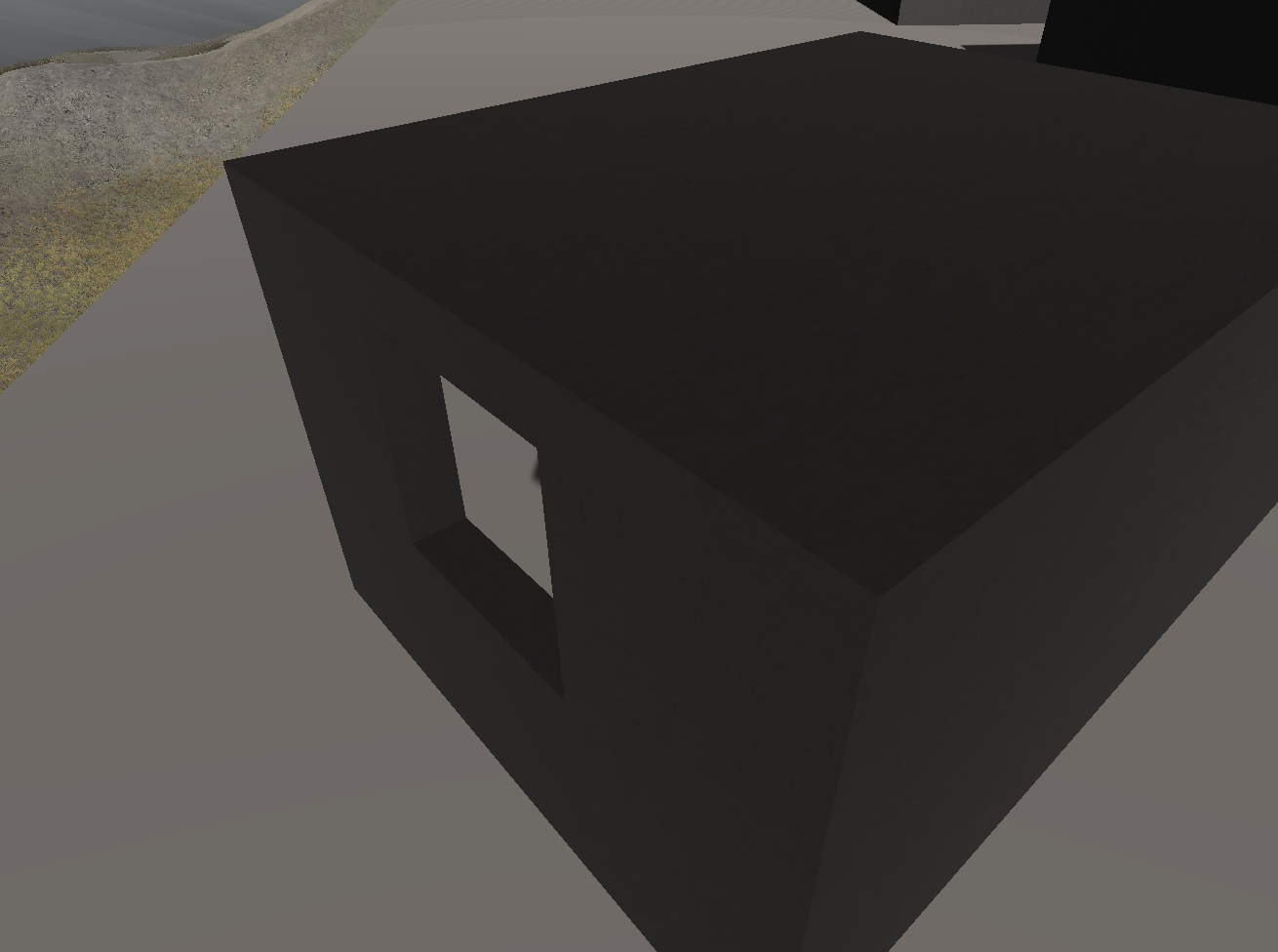
No problem at all. So I was like… oh okay, I guess I just build the room out of Unity cubes??? But I did notes some texture stretching later on which is bad. But just the fact that the seams weren’t visible massively surprised me? I feel like I went down this road already long ago and ran away from it? But somehow… but will…
Anyway today I’m going to try to go down this road again to see what happens!
And then I’ll essentially have to rebuild every room but if it works I do have the established pipeline for animating, adding scripts, etc. so it shouldn’t be too awful.
Time to forge ahead – Friday, 16 February 2024
Well then, 9 days later, I’ve replaced everything with the new construction and made every single room I’ve been planning to make?
Which is good timing because Now Play This got in touch yesterday (or the day before?) to say “okay, ready for the build!” and we had to negotiate a (not-too-big) extension. So I’ve got roughly two weeks to pull the whole thing into shape.
But thanks to the last few days, that’s looking pretty possible. Next step is, I think, positioning all these rooms in the landscape and making them accessible.
Once they’re in, I rethink the sun movement (I think no movement except on the appropriate dias), change the directional light room to snap the sun to a specific position (maybe use that trick in more than one place actually? Maybe that’s the fun way to do the exterior places… the sun snaps or animates to specifically where you want it, or even moves around there…! Nice one.)
So… yeah I suppose I Just forge ahead really, not much more to it than that.
Wayfinding, Sculpting – Thursday, 22 February 2024
Wayfinding
The rooms are positioned well enough not to worry about unless I have time to cycle back to it. That said, just to record it, the main thing I wonder about is whether there’s pathfinding stuff I should care about? Notably I was wondering if there was a good way to frame the “next room” via the doorway of the previous one. Essentially rotate rooms so that (most of the time?) you can see a new room frames out the doorway. Seems unlikely this is always possible?
Could also contemplate literal paths as a texture on the terrain? Sounds kind of gross and like I might overreach to such an extent I create something ugly. But generally the question: how much guidance do the visitors need? How much do I care? How much can I care? How much can I bend what skills I have to this task?
Sculptures
I had a first wee go at making a “sculpture”, ripped off that bandaid, at least a bit. As is typical with a prototype (I am listening to the Behaviour event at 4th space right now about prototyping) it helped to frame things up. Though I guess a bit contra prototyping best practice I do feel like… it made sense to just make “something” to try to find out what I’m looking or. I made (as per the commit) a kind of upside down multileg table, I positioned it as if dropped from the sky, I added a point light to cast shadows outward. It looked kind of cool. But also it looked like I didn’t know what it was for and I promised to reflect and here I ammmmmm.
SO? Well I think maybe to some large extent it’s better to think of the sculptures as visual interest in the landscape? Just things that have shadows? Maybe that’s a nice counterpoint to the formalities of the rooms?
ALTHOUGH they could have some other explorable property that only works outdoors (maybe even only with the sun at specific angles). Long shadows. Overlapping shadows. Non-shadows (e.g. diminishing gaps). Shadows falling across irregular surfaces. Stuff like that? Yeah I find this pretty plausible. Perhaps we don’t work with any lights other than the sun even, just move it to specific locations.
Seeing the one thing I had put in, there’s no question they can be a really nice addition to the world, a way to have something to look at between rooms, to reduce the feeling of slogging room to room. No names necessary, more just observable phenomena. So what kinds of things?
- Irregular surfaces (stair shapes, divots, …)
- Shadows across surfaces, between two offset planes,
- Long shadows, downhill shadows, up-hill shadows, landscape shadows
- Suspended/floating object shadows, standing in shadow, umbrella, awning
- Bus stop, a inside/outside place
- That classic “oh the shadow looks like something else” thing, but maybe fuck that for being way too hard
- Rotating the sun is cool though, maybe that could happen for every shadow, just the default is that each one triggers a day/night cycle at all times? Kind of nice maybe? Or best avoided? Think about it.
- Primitives and their shadows, the monkey head from Blender?
- The vase but huge somewhere?
- …
So… I mean I think it a way it should be more of a way for me to just make some shapes I want to see, drop them on the landscape, don’t overthink it, let them be a counterpoint to the overthinking-it of the rooms. Yeah? I will try that out.
“Done” – Tuesday, 5 March 2024
Well, I finished v r 5 in some sense last week. At least to the extent that I shipped it out to the Now Play This folks and have been working together all the pieces of the press kit and info page and so on. Theoretically I can/should release it into the wild (aka do basically nothing) tomorrow.
This slightly weirdens the idea of showing the game at A MAZE and having a fifth station where I’m working on it. What could I plausibly be doing? A DLC. I’m only thinking about this because I’m right in the middle of thinking about how that could look. (Alternately could I be working on the ChatGPT game by then sufficiently deep that I would have something to show for it? Maaaaybe? Maybe not… it’s two months away and my schedule is not great for getting anything done… would I realistically have 3-4 prototypes by then?)
Anyway my last journal entry was me mostly thinking about sculptural stuff in late February, and then soon after I did my major push to just finish the whole thing over the reading week. In this moment I’m not sure what my “big observations” are about that process outside of me just trying to get it done more than anything, both worrying about and trying not to worry about some of the higher level issues around wayfinding or usability or polish…
And do I feel like it does what I wanted? When I think back to the original sketches and ideas? The weird thing is the absolute earliest expression of the project is a PDF from mid-August, pretty much when I started that is… a pretty good expression of how the game itself turned out. Like the core vision (look at shadows) has been stable, and even the architectural design has been stable, and a lot of the time has been technical fights to bring that vision about (how much time have I spent making the island and fighting in Blender (and elsewhere) to make those rooms a reality?).
Very very late, too late, I remember that there is quite a significant set of notes in my Things item for this project, which is presumably the first moment I committed to an idea. It reads like this:
Shadows.
Rooms with shadows in them.
Windows that make patterns of light that show that there are shadows.
Rooms of increase darkness on a gradient.
Rooms with windows casting light to hit an object which casts a shadow.
Soft and hard shadows.
A lack of shadows.
Spotlit versus ambient versus point light shadows.
Shadows cast by invisible objects.
Lightmapping I assume?
Dynamic and non-dynamic shadows.
…
I suppose the point is to capture some of the aesthetic beauty as discussed in the book.
Reflective materials in gold on something, will they catch the light?
Things seen in dimness.
…
How is it signposted? I suppose the reference is probably to video-projection rooms in museums? A label outside the door with a description of the setup inside.
…
Double objective of seeing beauty and seeing technical implementation.
…
Colored shadows? Moving shadows? (Objects and lights that move)
…
Shadows cast through different numebrs and widths of bars on a window.
Modernist architecture.
…
Is this all taking place outside with individual rooms? Inside a large building?
I fear ProBuilder and I fear everything to do with 3D.
Tensions when talking about light/shadows in terms of production value. But minimalism makes a lot of sense here, don’t distract from the shadows. Possibly the objects that cast shadows should be primitives themselves for this reason? Just cubes?
Maybe cubes with colors? THe interaction of shadows with a colored surface?
…
The text talks about a scroll in a dim alcove, barely seen. What would go in that alcove in this game? Quotes from the essay about a scroll in a dim alcove, barely visible?
…
Is there any, any way to do this like the Judd installation? It doesn’t sound like it.
How easy is it to quickly make a small building with an inside and an outside in Probuilder? Can’t be THAT hard? Especially they’re basically just squares?
Do we/can we control the outside light? Do we like the idea that the sun might move and fade and change relative to which room you enter? (But what about the fact you would see the contents of the room from an unintended illumination before the lights swing into place?
There’s a “truth” to the idea of the sun being in one place, and perhaps then that we can position rooms relatively so they get some or no light from it? Exposures.
…
It’s about light and it’s about shadows, but it needs to be about shadows most of all.
Which… again, I’m taken aback by how much the project has been just this. Did I learn nothing?? And if I didn’t, isn’t that weird? Or… what does that mean? It was sufficiently well-defined that it was “just” an implementation challenge? Is that why the journal has been harder to write for this project? Maybe because there were so many conceptual challenges? Whereas the commit history has been really fruitful and where the action is.
So I suppose I should try to write a closing statement really and think about what happened. I’m realizing too that there are a few images I haven’t included here, so here are those:
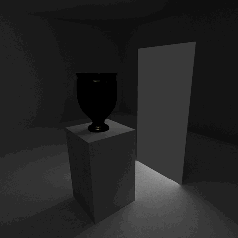
The flickering effect in one room was making the material (applied globally) on every light-emitting surface flicker, so it was throughout the world. Kind of a pleasant surprise.

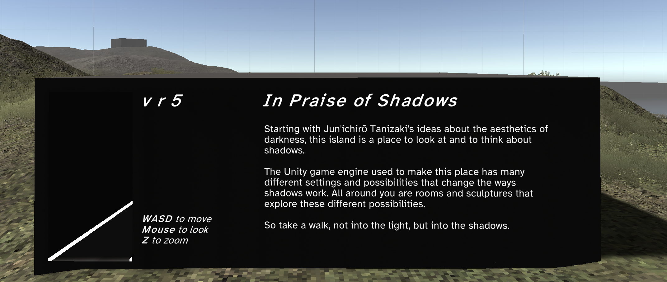

Spent quite a lot of time trying to figure out how to give the player-visitor some context without it being overwhelming or cloying or pretentious. This is where I landed.
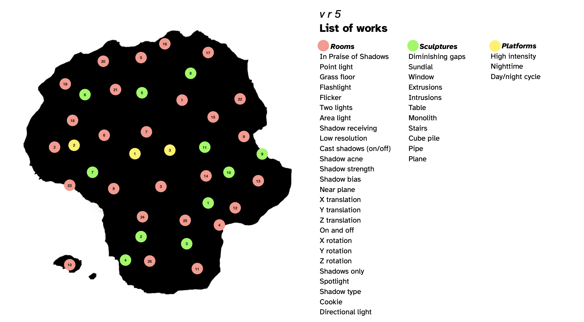
Did make a map that you can view as a separate document so you can keep track of/gain some understanding of what’s there.
Some other things I should reflect on:
- Relationship to MDM
- Nature as research-creation
- Value as a research object (for me personally)
- Desires for its life in the wild (if any)
- Writing another/final why
- … some other stuff?
“Closing time” – Thursday, 21 March 2024
Opening emo
Well… shit. I “released” the game yesterday. Where by “released” I mean I
- Pushed webgl and PC builds
- Tweeted it
- Instagrammed it
- Ran out of ideas
- Put it on Reddit
- Put it on itch.io
- Told TAG on Discord
- Fixed a couple of bugs people on Twitter kindly pointed out
- The end.
I’m pretty used to how underwhelming finishing a game is, especially in the new climate of it being almost impossible to get your work in front of anyone unless you’re incredibly well-known or spend a very substantial amount of time and money on marketing. Which… well let’s say I’m in a liminal space where those things are pretty much not true for me (any more? ever?).
This game was quite a lot of work (seven months start to finish, did coincide with being chair of my department which was not exactly a speed boost). But there’s kind of nowhere for it to go. Well, it will be at Now Play This which is cool! And it lives on fondly in my memory and process documentation! But there’s not going to be that sense I used to have where a bunch of people would play, offer feedback, press would look at it (I suppose I should send it to press but that is so fucking depressing these days as well). I got to have that experience and it was good and I miss it.
BUT, guess what, I still pretty much make these things because I enjoy making them and I enjoy the brain-feel involved in it. The release and the feedback is vastly less important. Don’t ask me whether any of this matters though. Please.
So mostly my brain is doing the classic two-parter of “let’s move on to the next project!” along with “let’s never do anything ever!”
Specifics
While I’m thinking about it, I did make an in-game map that is pretty decent. Toggled with M. Shows dots where all the “stuff” is and greys them when you go there. Had a fun bug where you could see the map dots (which are in the world for reasons of it being the easiest way I could think of to make a map - literally just looking down on the actual island with a camera and putting giant dots over the buildings) reflected in water. I’d disabled them for the FPS camera but not for the reflection camera of the water:
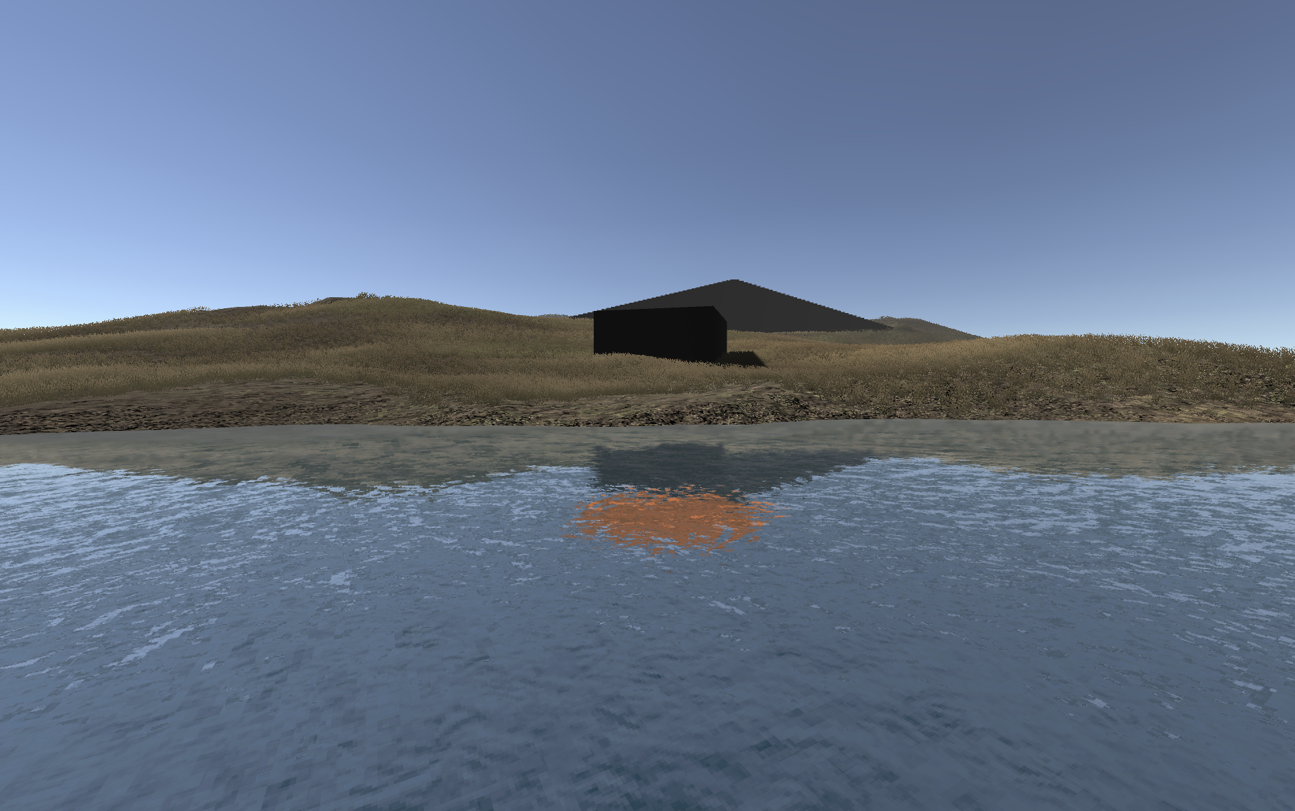
So that’s fun.
Taskrabbit
I assigned myself some sensible reflective tasks in the previous journal entry:
- Relationship to MDM
- Nature as research-creation
- Value as a research object (for me personally)
- Desires for its life in the wild (if any)
- Writing another/final why
- … some other stuff?
I suppose I owe it to that guy to try it out.
Relationship to MDM
This was a good project for MDM from my perspective because I was coming back from sabbatical and more present (if not totally present) at the meetings we have for Games as Research. That notably meant just hearing a bunch of other use cases and having that trickle into my own thoughts.
The big take-away here for me was that the commits because absolutely huge, drowning out the journal or any other documentation form. And I found that very satisfying at least for this one - it felt like exactly the right place to be doing the thinking. And perhaps that’s because this game was so much about technical exploration of Unity specifically? Perhaps also I had just established such a tight frame on what it would be (island with rooms with shadows) that there wasn’t as much soul searching at a design/journal level to do frequently?
It does mean that I think the documentation feels more moment-to-moment and perhaps has less perspective on what the “point” of the game is. I was just taking it as read that exhibiting a technical feature of a game engine is worth doing because I’ve done it before, so my focus was on how to do it, and the how is somehow more in the commits?
I guess one thing you could say about that is that commits feel like they’re in the foreground when it’s “technical practice first”, and then the commit is a great place to reflect on that practice. Whereas I think journaling comes to the fore when it’s perhaps “design first” which you will then lead into the technical practice after?
Well anyway, the commits here are plentiful and I hope pretty fruitful. As I write this there are 146 of them. In reviewing a few at random… well, they tell the story.
BUT this all for sure makes me think (in part because the research group itself is focusing more on analysis) about the relationship between design writing and the meta-analysis of that design writing and how much of that can/should take place simultaneously. Should I be noticing meta themes about my design process while I design? Where will it all end up.
Nature as research-creation
For a beat I read that as “nature” as research-creation, like the great outdoors, the natural nature of shadows. But no, I just meant “how is this research creation”?
Which is a truly exhausting question I do not really want to answer. But let me at least bounce of it as hard as I can manage, maybe I’ll break through.
I mean it’s partly tiring because a question like this always ends up feeling like I’m being challenged to justify my entire research existence and one instinctual reaction to that is just “fuck you! This is my work!” but another answer is just… well, this is part of a growing body of work where I pretty obsessively look to surface the underlying nature/technologies of games.
Why is that research creation?
Well because in doing so you have to think very specifically about the materials of game design directly, not just taking them forgranted as the stuff you put together. If you’re designing to make them heard/seen then you need to know much better what they can sound like and look like. And indeed in the v r stuff it’s often about trying to get some handle on all the ways they appear even. (Just paused to make a note on making the game The Library of Bitsy.)
v r 5 surfaces the nature of shadows - though pretty gently? No hyper direct surfacing of parameter values for instance. But just pointing out that shadows do different things and look different ways based on what casts them, the light, the settings. And it occurs to me that of course a bunch of them are also to do with how shadows act in the real world, which I think is nice, and is about the ways in which shadows in unity are and are not naturalistic.
For the player… well I continue to like the idea that the game itself (and this series and many of my things) are a kind of vehicle for research by the player at a more controlled level. You play this game and you are, yourself, investigating the nature of shadows in Unity, encouraged to think about and focus on them. Ha, it used to be about being “in on the joke” for my game and now it’s like “co-investigator” which is… I mean it’s good but it’s also quite depressing.
Note to self: make more jokes. Haha.
Okay. Well. Whatever, that’s my thoughts.
Desires for its life in the wild (if any)
I think I covered my general low expectations for this up top. It would be great if people were super into it, but I just don’t think that, in general, people are super into independent free art games in general so… well so what.
So what does success look like then? An exhibition (done), a release (done), ideally some press/critical coverage (nope), some writing and presentations generated from it (will happen), … the end. I mean, pretty solid.
Should I, at some point, try to make a successful game. Nah.
Writing another/final why
I feel that resentment again. FUCK YOU!
But yeah. I will anyway.
And then there’s also the “closing statement” which… god give me fucking strength. But I will try because I am a good boy who wants a dog biscuit.